North and Peter Saville design evolving identity for Factory International
Factory International’s wordmark takes cues from its new building, Aviva Studios, while its wayfinding and brand guidelines have been applied in a fly-poster style.
Factory International’s wordmark takes cues from its new building, Aviva Studios, while its wayfinding and brand guidelines have been applied in a fly-poster style.
After using separate identities across UK and US markets, Kahlúa wanted to bring character back to its logotype and strike a balance between communicating its heritage and its coffee credentials.

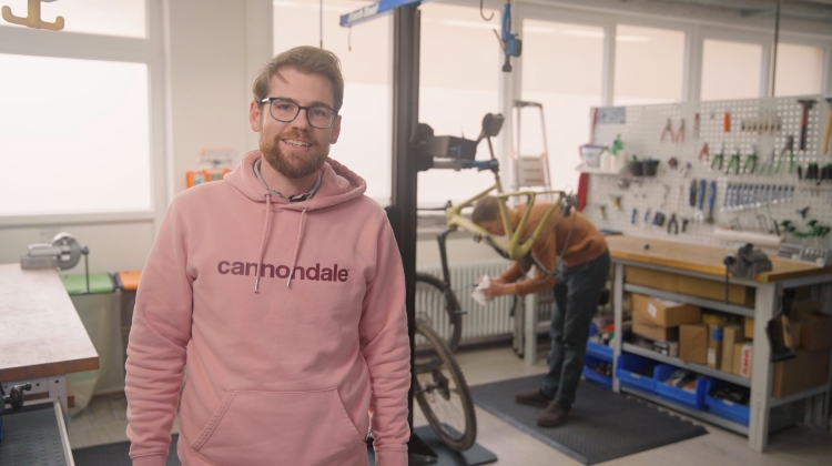
Ian Surra, director of Cannondale industrial design talks through a day in the R&D office in Freiberg, Germany.

The identity features a unique logotype inspired by the Memphis Sanitation Strike of 1968 and a secondary typeface informed by posters used in racially charged protests in the early 1900s.

A food hall in Toronto and Italian restaurants in London and New York are among our favourite interior projects of the month.
The German football club has a new identity positioned around the 34º angle of its stadium stands to retell the “compelling story” of a club powered by its fans’ devotion.

For a Natural History Museum-led climate education scheme, the studio shaped an identity inspired by the joy of exploring nature featuring paper-cut style illustrations.

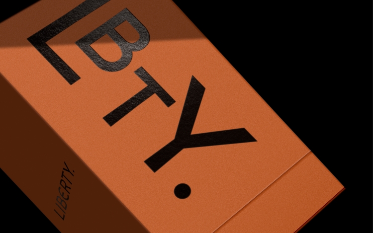
Inspired by the discovery of “typographic shorthands” in the Liberty archive, a new LBTY logotype was designed to adapt the main Liberty identity.