The new BrewDog identity – who designed it and how it was done
The independent brewer’s new look has been created with Made Thought and marks a change in the company’s positioning as it looks to embrace a more sustainable future.
Scottish craft beer brewer BrewDog has unveiled a new visual identity, which aims to support the company in its new sustainability mission.
The project, which features a considerably more pared back look and feel than previous versions of the brand, was led by London-based design studio Made Thought and BrewDog’s in-house team.
So far, the new look has been revealed across some of the brewer’s most popular beers, including its Punk IPA and Dead Pony Club session pale ale, though it may roll out further across the Brewdog drink and bar portfolio, according to Made Thought.
“A more comprehensive approach to design”
While the colour palette for each beer remains largely the same, the new label designs feature cleaner graphics and tonal colour variation on each drink.
“Brewdog has always had a very simple and straightforward approach to design, really focusing on bold colour and even bolder use of type and voice both in packaging and its communications,” says Ben Parker, co-founder and co-creative director of Made Thought. “We wanted to preserve this but give more richness and texture to both colour and text.”
Alongside this, the update sees the Brewdog wordmark positioned horizontally, rather than vertically as it had been in the past.
BrewDog’s strapline: “United we stand for better beer – Fiercely defiant and independent”, delineates a new shield-shaped label. The dog icon no longer sits within a shield-shaped lock-up and instead appears at the centre of the new identity.
The new look, according to Parker, aims to support BrewDog’s ever-expanding number of touchpoints flexibly.
“Producing over 100 different beers a year, having an international bar and hotel portfolio and 4 breweries created the need for a more comprehensive approach to design,” he says.
“Lost in its anti-establishment tone”
The new look is supported by a repositioned brand personality and tone of voice. While known and celebrated for its “anti-establishment” approach, Parker says the discussions during the project quickly focused on how this could be adapted and developed further.
“Understanding more about the business, we believed the way it visually presented itself, always at full volume and with a sense of nonchalant rebellion was impactful but was masking its ability to communicate all the amazing things that it does,” he says.
Instead, the Made Thought team began to home in on what it thought was BrewDog’s most captivating asset, what Parker recognises as a “refreshingly human yet radical” way of doing business.
“BrewDog is a fast thinking business which can be lost in the anti-establishment tone it takes, so we wanted to give a greater sense of meaning, substance and purpose to its actions and the overall brand feel.”
Signalling “a deeper change”
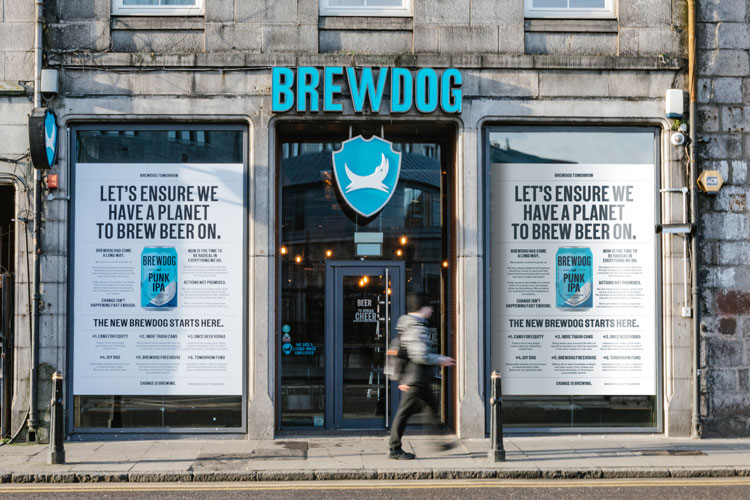
The new visual identity has been launched to coincide with what BrewDog co-founder James Watt calls “a new dawn” for the company. Chiefly, this relates to the launching of BrewDog Tomorrow, a six-point charter that outline’s the brewer’s commitment to sustainability.
Aiming to “chart a new course for business [that] balances profit with people and planet”, the plan includes points like a pledge to “upcycle” old cans by refilling them, a scheme that will see imperfect beer distilled into vodka to minimise waste and a £1 million a year fund to support research initiatives that help the brewing industry to have a positive impact on the world.
“Often, disappointingly, a rebrand is simply seen as a visual overhaul – new surface decoration,” says Parker. “For us, it must always go deeper than that. It must signal deeper change, which is precisely what the BrewDog project has been driven on – how can we create a more sustainable and responsible business, that is more relevant than ever?”
He adds: “The rebrand is an opportunity to tell a new story of change.”


Never heard such a load of twaddle in my life. Perfect illustration of ‘If it ain’t broke, don’t fix it’, and sounds like someone somewhere trying to justify their salary. I will however catch the spirit of their initiative by trying to reduce my consumption of Brewdog products and therefore reduce my impact on the environment. Clowns…
Poor little snowflakes – can’t take a dose of realism/criticism. Clowns….
I’ll go back to Sierra Nevada….
Indeed “BrewDog is a fast thinking business which can be lost in the anti-establishment tone it takes,” so we will be less anti, so we can continue making money….such hypocrisy.
Don’t get this rebrand at all – the old designs look great and the craft beer industry is known for showcasing great design. Now the cans look like a supermarket own brand really not sure who they’re aiming their product act now?