Nordoff and Robbins rebrand denotes soundwaves and music notations
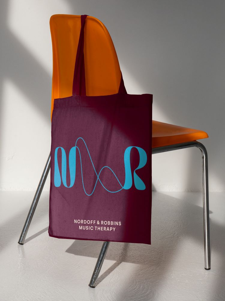
Pentagram sought to incorporate non-traditional music cues through a hand-drawn logotype with an abstract ampersand.
Pentagram partner Marina Willer has led the rebrand of UK music therapy charity Nordoff and Robbins, tweaking its name and designing a logo inspired by sounds waves.
Since being founded in 1959 by American composer and pianist Paul Nordoff and special education teacher Clive Robbins, the charity has worked to create a space for people to express themselves through music as well as carrying out research and educating music therapists. Pentagram says it was invited to pitch as it has experience in charity branding projects, including Maggie’s, Asthma + Lung UK, and Blood Cancer UK.

According to Willer, the project resonated with the team because of its “strong social cause” and the fact that the charity “recognises human potential regardless of profound disability or social exclusion”.
Pentagram proposed a tweak to the name which resulted in a new graphic asset: an abstract ampersand. This is a contraction of the new name Nordoff and Robins, which has replaced Nordoff Robins. Willer says that the studio puts a lot of consideration into proposing names changes, only doing so when it can help a brand to “achieve the necessary impact”.
Despite the temptation to opt for something “much simpler”, Willer says the studio was conscious that losing the founder’s names could “put a lot of legacy to waste”. With its new name – Nordoff and Robbins – Willer explains how that the charity can better express “the particular connection that music therapy can bring” through an ampersand linking the founder’s names in the shorthand logo.
Seeking to highlight Nordoff and Robbins’ “unique point of difference”, Pentagram took influence from soundwaves and various styles of music notations for the hand-drawn logo, says Willer. Its purpose is to illustrate music in a non-traditional sense – which was one of the most difficult aspects of the design – as well as demonstrate the “open and broad” nature of music therapy, she adds.

The accompanying font that appears in the whole lockup is Silka, by Atipo Foundry. Willer describes it as “modern, direct and factual”, contrasting with “the individual character of the logo symbol”.
Pentagram chose to use the same type family for headlines and text. It allows the brand to convey both a “human and professional” personality, says Willer, adding that the charity can use a bold weight when it needs to convey “authority and approachability”.
Nordoff and Robbins will also communicate to its audience through waves, lines and icons which take cues from the single line structure of the logotype. Willer says that all of the brand elements had to be simple and take accessibility requirements into account, striking a balance between “inviting and intriguing” and “clear and identifiable”.
The charity’s colour palette combines vivid hues with more natural, muted shades. It was important to be able to covey the “diversity of moods and wide range of people” who interact with the charity, says Willer.
While Nordoff and Robbins provided most of the imagery, Pentagram sought to curate a selection that felt “real and authentic but not exposing or manipulative”, Willer explains. “Charities dealing with tough health conditions often explore pain in the photography they use in a way that is not always respectful of those featured, and we wanted to make sure we did not follow that path”, she adds.
-
Post a comment


