Calvin Klein unveils new logo in collaboration with Peter Saville
The graphic designer has worked with the fashion brand’s in-house creative team to tweak the logo and “return it to the spirit of the original” one.

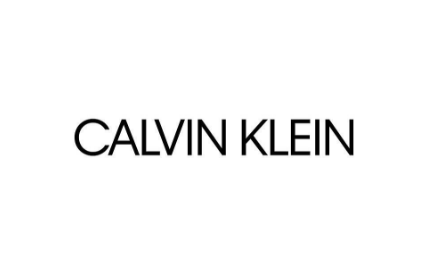
Calvin Klein has a new logo, which has been tweaked and redefined by graphic designer Peter Saville.
The fashion label has swapped out its lowercase logotype for an uppercase one with a smaller kerning gap between letters, retaining its black colour and sans-serif.
The new logo was unveiled on the brand’s Instagram account, with Calvin Klein saying that the new logo is a “return to the spirit of the original”.
It aims to pay homage to the self-named company’s founder, who launched the US company in 1968, and to the “foundations of the fashion house”, says the company.
Calvin Klein’s in-house creative team, headed up by chief creative officer Raf Simons, worked on the new logo, collaborating with Saville.
A lowercase “ck” previously sat above the Calvin Klein logotype and was used alongside it – it has not yet been confirmed whether there will be a new short-hand uppercase “CK” icon to go alongside the new logo.
The previous Calvin Klein logo
Raf Simons is a Belgian designer who joined Calvin Klein in August last year, having previously held a role at Christian Dior. Peter Saville, originally from Manchester, is best known for his record sleeve designs for Factory Records, for artists including Joy Division.


I fear that this kind of rebrand runs the risk of giving designers a bad name. It looks to the outside world as effortless despite the prior discovery and definition work that will have inevitably taken place before it’s reveal. Designers already spend too much of their time attempting to prove value in their work and this kind of rebrand, very much in the public eye, will inevitable spur the cynical.