Mucho’s identity for a fishing group hopes to hook a wider audience
The new branding centres on a bespoke typeface, which makes reference to both fishing and the company founder’s height.
Design studio Mucho has crafted the branding for Big C Charters, a charters service based in the San Francisco Bay Area.
The company offers fishing trips, whale watching and custom excursions around the local area. It’s named after its founder, former professional basketball player Christian Cavanaugh. More specifically, it’s a reference to his notable height of 6’8’’.
The studio, which has offices in San Francisco, Europe and Australia, has worked on a new wordmark, colour palette, bespoke typeface and a wide range of branded collateral.
Mucho was brought on board to help the company streamline its identity as demand grows. One aim for the identity was to appeal to a wider audience in terms of age and experience, explains the design team.
The team developed a bespoke typeface for the new identity, named Big C Sans. The ambition was to reflect the company’s activity and also combine a vintage feel and a modern look, explains the design team. “It features elongated letterforms with characteristic fishing hook/wave-like terminals that fuse antiquities of early san-serif lettering with a contemporary typeface,” the studio adds.
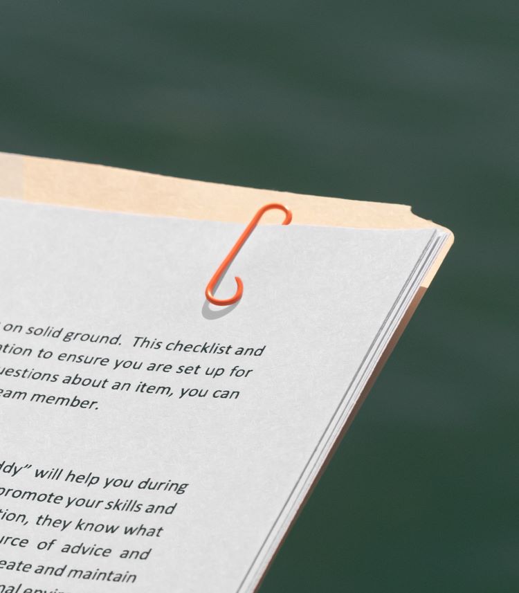
The typeface can also be seen across branded apparel, stationery and on the boats themselves. It also provides the basis for the logo, which the studio calls the “Big C Symbol”. This has been incorporated across branding, including a c-shaped paperclip.
The colour palette has been inspired by tones found on Big C boats, which include hi-vis clothing, bait flashers and hooks. Hi-vis yellow, black and white are the primary colours used, while red, teal, orange and pink provide the secondary palette. “These colours buck the category cliché of ‘ocean blues’ to help challenge the old fashioned perspective around fishing,” says Mucho.
Another aim of the new branding was to emphasise the individual personalities involved with Big C Charters, explains Mucho. Crew now have jackets customised with their initials, which aims to incorporate a team spirit and help passengers identify staff, according to the design team. The boats have also been personalised.

For the wider merchandise range, Mucho collaborated with local craftspeople such as jewellery makers Cali Clay on a collection of earrings. These reference fishing hooks and also the brand’s c symbol. Photography has been updated in a “reportage style” which aims to capture realistic moments on the sea, adds Mucho.


An example of a piece of graphic design with a clever, witty idea often missing from the discipline these days. I love the paperclip.