Twitter rebrands to X with “good enough” logo
Following the first glimpses of Twitter’s rebrand as X, featuring a crowd-sourced logo co-existing with old elements, we went to designers for their thoughts.
Elon Musk has announced the rebranding of Twitter to X, replacing its familiar blue bird logo with an “art-deco” X, following a brief call-out for a new design on Twitter.
Musk bought the social media platform in October 2022, on the promise of enabling free speech by scaling-back moderation and reinstating banned users such as Donald Trump and Andrew Tate.
However, it was recently announced that Twitter had lost nearly half its advertising revenue since Musk’s takeover.
New CEO Linda Yaccarino, also posted about the rebrand over the weekend, writing, “it’s an exceptionally rare thing – in life or in business – that you get a second chance to make another big impression.
Musk posted at the time of buying the social media platform, that the move was part of his intention to create “X, the everything app”, a super-app similar in scope to WeChat in China. The official company name had also been changed to X Corp back in April.
A thing for the letter X
Musk’s first ventures in creating X.com goes back to at least 1999, with his intentions to create a banking app that was to become PayPal.
X is also a common theme between his brands SpaceX and Tesla, and Musk also recently launched AI startup xAI, which according to its website hopes to “understand the true nature of the universe”.
A call out for a “good-enough” logo
Rather than revealing a polished rebrand – as did Facebook parent company Meta back in 2021, working with in-house teams and Saffron – the tech billionaire started rolling out the rebrand part-by-part, leaving the job of designing a new logo to the platform’s users.
Musk Tweeted “if a good enough X logo is posted tonight, we’ll [sic] make go live worldwide tomorrow”.
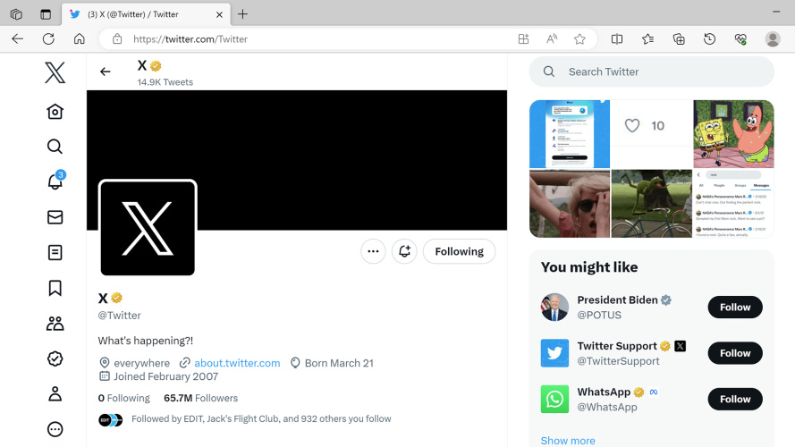
The X logo has been projected onto the façade of company’s offices in San Francisco, and now appears on the desktop version of the app, but does not yet appear on the mobile app.
In lieu of a brief, Musk Tweeted a mock-up of the a new app icon, with the Twitter bird in white on a black, distressed-finish background, with the direction: “Like this but X”.
He also posted, “If X is closest in style to anything, it should, of course, be Art Deco.”
— Elon Musk (@elonmusk) July 23, 2023
Among the responses was a black and white logo and related teaser video, posted on the platform by user Sawyer Merritt, not a designer, but a co-founder of a sustainable lifestyle apparel brand and Tesla investor, according to his Twitter bio.
In a Tweet, Merritt commented that the design was based on a logo first created for an abandoned podcast project.
Since it was shared, some of the platform’s users have suggested a similarity to the 1980s X Window System or the Xbox Series X logo, as well as Monotype’s Special Alphabets 4 ‘X’ glyph, used for Unicode.
Adieu to all the birds
While Musk is happy to say goodbye to the logo, posting: “And soon we shall bid adieu to the Twitter brand and, gradually, all the birds”, Twitter’s brand guidelines described the logo as its most recognisable asset.
It has been used by the brand in different iterations since 2006 and was named “Larry T Bird” by Twitter co-founder Biz Stone, after the basketball player Larry Bird.
James Greenfield, Koto CEO and co-founder says, “For all Twitter’s flaws, much of the brand and product has been well designed over time.”
He adds that Twitter’s “nomenclature”, is “one of its best attributes”:
“The name is evocative and speaks to the experience, a post has its own related name (a tweet), even how you reply feels branded. All of this has been in place for many years and changing that is a big, big task, especially as its users feel a sense of ownership over the brand.”
Other details include the home icon shaped like a bird house, and the feathered quill used for the compose Tweet feature.
In contrast, the new name “doesn’t lend itself to being very useable”, he adds.
“Massively underestimated”
Greenfield notes that the branding roll-out is as yet uneven, with old and new elements existing side-by-side:
“When I opened the product today it has a big new X logo in the top corner, yet ’Tweet’ still sits in a blue CTA button, the bird is still there in my app.”
He suggests this implies Musk and team have “massively underestimated” what a rebrand will take.
“I don’t think you can crowd source a brand on a Saturday night and then bit-by-bit release it without having a serious effect on the trust in the product.
He says that “ironically” the lack of trust “is the one thing the advertisers were already struggling with, and why they left”.
Greenfield notes that for some of the functionality that a super-app would offer including financial services, building trust and an understanding of the audience is essential.
“The big super apps in Asia have built up over time, adding functionality and audience step-by-step. It takes time, some consideration and an understanding of consumer behaviour to do that”, he adds.
Greenfield suggests that an agency could still be brought in, adding, “I just hope it’s not too broken at that point, because the last thing the audience will need is more change to deal with”.
“X will mark the spot”
Design Bridge and Partners global CCO Greg Quinton and CCO Emma Follett both responded to the news.
Quinton suggests that as the richest person in the world, Musk “can do whatever he likes”. But even if he “doesn’t seem to care about branding”, Quinton adds, “brands can’t defy gravity; they go up and they also go down”.
Like Greenfield, he highlights the need to consider the users. “Social media is, at its core, social. It’s about their experience, not whoever owns the channel.”
“Give users another reason to fly off elsewhere, what do you have left? X will mark the spot”.
“An anti-brand/non-brand”
Design Bridge chief creative officer Emma Follett adds: “It seems more important that this exists in the world, rather than it stand for something. Brand X is the anti-brand/ non brand”, she says.
However, she suggests some possible logic to this approach.
She notes that X is open “to be anything it wants to be in the future. An all-encompassing brand that could take over anything and everything, collaborate with anything, partner with anyone, “an everything app”.
With many aspects “likely to change and will most likely be refined” still, the manner in which Musk revealed the rebrand “goes against the foundations of branding”, Follett
She notes that it is the opposite to Twitter, which had “an identity that perfectly embodied the purpose of the platform”.
Without a defined brand, questions also remain about X’s purpose, “otherwise, it’s more likely to be about its founder”, Follett says.
“Brands last longer when they are about what they stand for”, she says.
“When your brand is tied more to a personality, love them or hate them, that can be a difficult thing to sell”.
Image by kovop and rafapress on Shutterstock.


OK – but why such a badly considered and designed X…
Given the evidence of who is being allowed back on the Twitter platform and Musk’s own right-wing friends in the Tate brothers, Trump et al we know that some near future iteration of the brand is going to resemble the swastika.
I am sure there used to be an article in a creative magazine many years ago where they invited designers and agencies to make a hypothetical pitch for a difficult and controversial subject. Think it might be time to revive this initiative. This week the subject will be; ‘Sell me the new Twitter identity and convince me why it is better than the previous design’ I suspect it won’t be easy.
Me thinks E Musk has taken a lead from The Rise and Rise of Reginald Perrin
A late comment as I realised a fundamental flaw in the re-branding of Twitter and something I have not seen picked up elsewhere. The brand changed to X but any messages sent on this medium are referred to as ‘tweets’ This means the change of name was completely pointless. Not only that, but nearly everywhere the company called X is still referred to as /twitter or formerly twitter. Obviously not working.