Team GB unveils new identity ahead of Paris 2024 Olympics
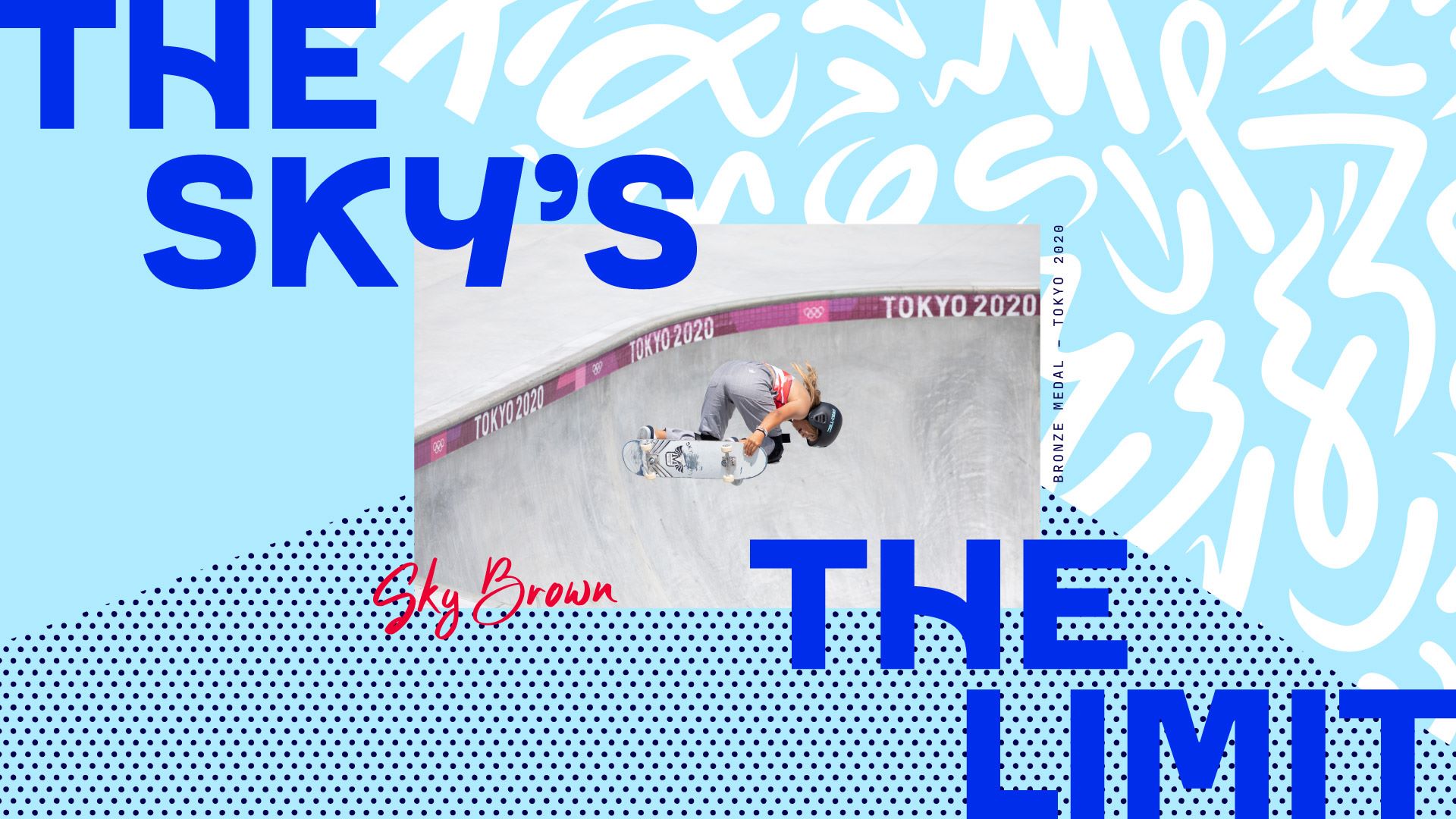
Thisaway has positioned the brand around the diversity of Team GB athletes through an extensive suite of graphic illustrations in a bid to keep it relevant when the games are not being held.
Thisaway has devised a new brand strategy and identity for Team GB, centred around a brand idea that “goes beyond sport” to make it more relevant between Olympic games events.
The studio won the project via a tender at the end of 2021 and has spent over a year working on it. Thisaway founder and creative director Graeme Cook says Team GB’s previous guidelines focused mainly on “the use of the logo and how to lock it up with commercial partners”, with few other visual assets.
In the research phase, the studio spoke with internal stakeholders, such as the Team GB CEO and board, as well as the athletes and commercial partners, including Adidas and Aldi.
Cook’s understanding was that, while there was a lot of love for the team, “people only switch onto them as a brand every few years for the summer and winter games”. He argues that Team GB’s old slogan – Believe in Extraordinary – was a little ambiguous and more “athlete-focused”, so it was tweaked to portray the Olympics as different to other “elite sports”, such as football, rugby and tennis “where athletes are put on pedestals”.
Team GB Illustrations from Thisaway on Vimeo.
The new slogan – Everyday Extraordinary – was chosen to highlight that the athletes come from all backgrounds and encourage more storytelling across this brand to help it stay relevant between games, according to Cook.
Thisaway encourages Team GB to talk about subjects “beyond the Olympics”, like mental health, wellness and diet, says Cook, adding that “Team GB is one of the few which has the permission and gravitas to do that and have people listen”. Its new strategy ultimately looks to increase visibility “throughout the Olympic cycle”, says Cook, with a visual identity comprised of “recognisable assets” to work alongside the lion logo.
There were no changes to the form of Team GB’s equitable logo as it was not in the scope of the brief, but it has been evolved with “exploding, Union-Jack-like animation” to “add more dynamism”, says Cook. Motion is used more widely across the identity to make the brand feel “active” and can be “dialled up and down” as games approach, he adds.
Team GB Logo from Thisaway on Vimeo.
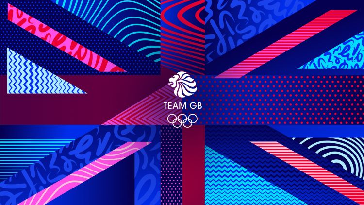
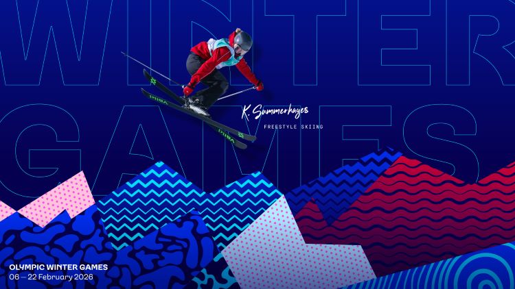
Team GB’s new suite of graphic patterns and abstract illustrations aims to convey its diversity, representing “the attributes that make up an athlete”, such as agility, precision and speed, according to Cook. He explains that Thisaway opted for relatively “agnostic” attributes that can fit with various sports and can be used in isolation or brought together to form “more of an illustrative visual”, such as the winter sports and athletics scenes. The illustrations were done in house, meaning the internal design team at Team GB has ownership and does not have to commission an illustrator every time a new sport or attribute is required.
Team GB Spectrum from Thisaway on Vimeo.
Thisaway’s audits revealed that other countries such as France and America also use Team GB’s primary colours: red, white and blue. While the primary colours have been retained, Cook says the studio introduced “tonal shifts” of each colour to make it “more distinct” from other countries. For example, as well as primary red Cook says there is also a “deep maroon” and a “zingy pink” to expand the colour spectrum.
Previously, Team GB was using a deep navy hue across much of the brand which Cook describe as “heavy and corporate”. Thisaway’s aim was to make the brand look “young and energetic”, says Cook, as data from Team GB suggested its primary UK audience is over 40s. Deeper tones like the navy are still used in more premium applications, such as presentation boxes and a book celebrating 125 years of Team GB.
Team GB Typeface from Thisaway on Vimeo.
Typographer Lewis McGuffie was commissioned to work with Thisaway on a family of typefaces called Team GB Sans. It was designed to feel like it “has movement”, contrasting with the stiff condensed typefaces often used in sport, Cook explains. He adds that Team GB Sans comes in different weights for body copy and display applications and also features “expressive glyphs” to differentiate the everyday from the more characterful extraordinary.
-
Post a comment
