Landor & Fitch rebrands Eurotunnel Le Shuttle
Now named LeShuttle, the service hopes to present itself as an easier, greener alternative to air travel with a new “progressive” logo and “innovative” colour palette.
Landor & Fitch has rebranded Eurotunnel Le Shuttle with the revised name Le Shuttle and created a new wordmark in a monochrome colour palette as it seeks to attract new travellers.
LeShuttle is a railway shuttle service that carries both passengers and vehicles between France and the UK. The change comes as part of a wider strategy to rethink the Channel Tunnel experience over the next decade, according to Landor & Fitch.
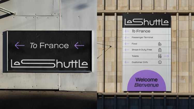
Having been involved in designing the outgoing Eurotunnel Le Shuttle identity in 1996, Landor & Fitch was asked to take part in a pitch.
In a bid to separate the infrastructure (the tunnel) from the service (the railway shuttle) Landor & Fitch simplified the name to LeShuttle. Previously there had been confusion between Eurotunnel and Eurostar “owing to the similarity of the names”, says Landor & Fitch executive creative director Graham Sykes.
The new name also links to the strategy behind the design work which is to better communicate the services offering such as its “speed and convenience”, says Sykes, and the fact that it is less restrictive that air travel. “Your Way” is the phrase driving the strategy.
To avoid the “traditional travel industry convention of pairing icon and wordmark”, Sykes says the studio designed a typographic logo to represent “the journey of the traveller”. It sought to achieve this through the conjoined L and S which indicates the length of the underwater tunnel, as well as the two tunnel-like shapes used for the letter e towards the start and end of the name.
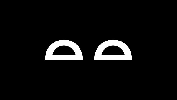
Sykes explains how the mark is “built with fixed anchor points” so it can be easily animated to “evocatively capture the varied nature and free spirit of the many different types of LeShuttle journey”. Designing a mark that was “progressive, imaginative and different” was the biggest challenge during the project, he adds.
The tunnel shape that appears in the wordmark is used to highlight key messages across the identity. It also serves as a framing device both static and in motion, says Sykes, describing it as “a portal to dreamlike memories of speedy trips and slow halcyon moments”.
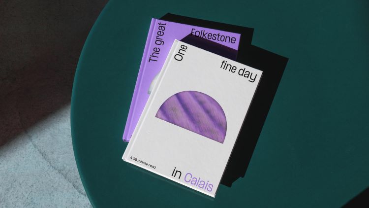
Formula by Pangram Pangram is LeShuttle’s primary typeface. It provides a “brilliant, bold, racy base” that can adapt easily with its multiple weights and styles, according to Sykes. He adds that Landor & Fitch is currently in the process of building “a complete custom suite”, including a display, headline and body copy typeface, which will evoke a similar typographic style to the wordmark of the mark.
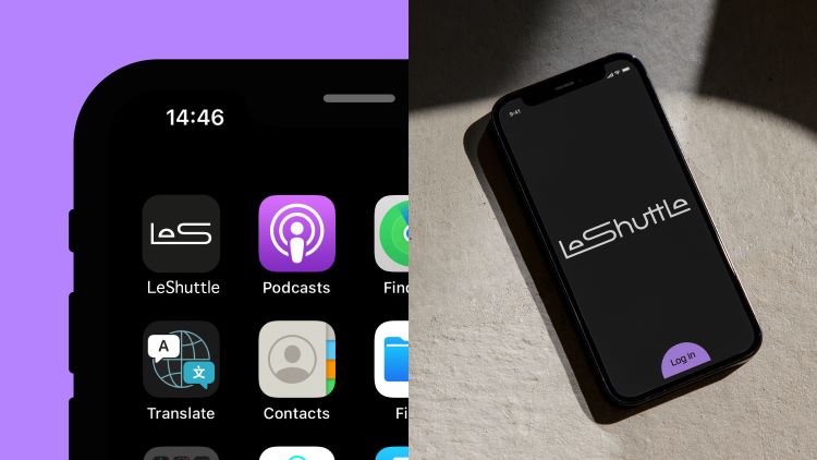
An overhaul of the colour palette was needed to “reimagine LeShuttle as a premium service brand”, says Sykes, which meant leaving behind the “traditional nationalistic sensibilities and infrastructure semiotics” of the previous red, white and blue hues.
Using a monochromatic base of black and white, Landor & Fitch then added in an “Electric Lavender” and “Aqua” shade to represent “innovation and optimism”, says Sykes. Further colours in the brand’s palette have been taken from the European landscape, he adds.
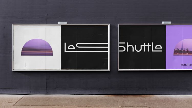
LeShuttle’s new identity will roll out on all physical and digital touchpoints, from trains, signage and terminals to communications and social media.
Good grief. Does the whole world have to look like a gen z club night?
Tricky. Love the use of the shape to create the “e” and really like the standard logo. Somehow it manages to embody speed which is really clever. On the other hand, when stretched across signage etc just doesn’t work and becomes very distracting. The use of typography feels very sloppy, with little consideration for legibility.
oh……………………
Typographically confusing, juvenile and unimaginative. As for the switch from “Le Shuttle” to “LeShuttle”: seriously???
How far things have come. I remember listening to ‘Yes Minister’ on the BBC where they talked about which language should come first on the signs on the Shuttle – French or English. Now it’s been renamed as a French product.
Not so keen on the animation. How come the ‘train / logo’ passes to the far right and then moves back. Odd creative direction.
Looks like the results from a one day brief for an A Level Design Class.
Cannot say that the logo work does much for me, one way or the other.
But the Tunnel services are fine: I’ve used both Shuttle and Eurostar since they opened in the mid-1990s.
Absolutely dreadful.