Nickelodeon rebrands for the first time in 14 years
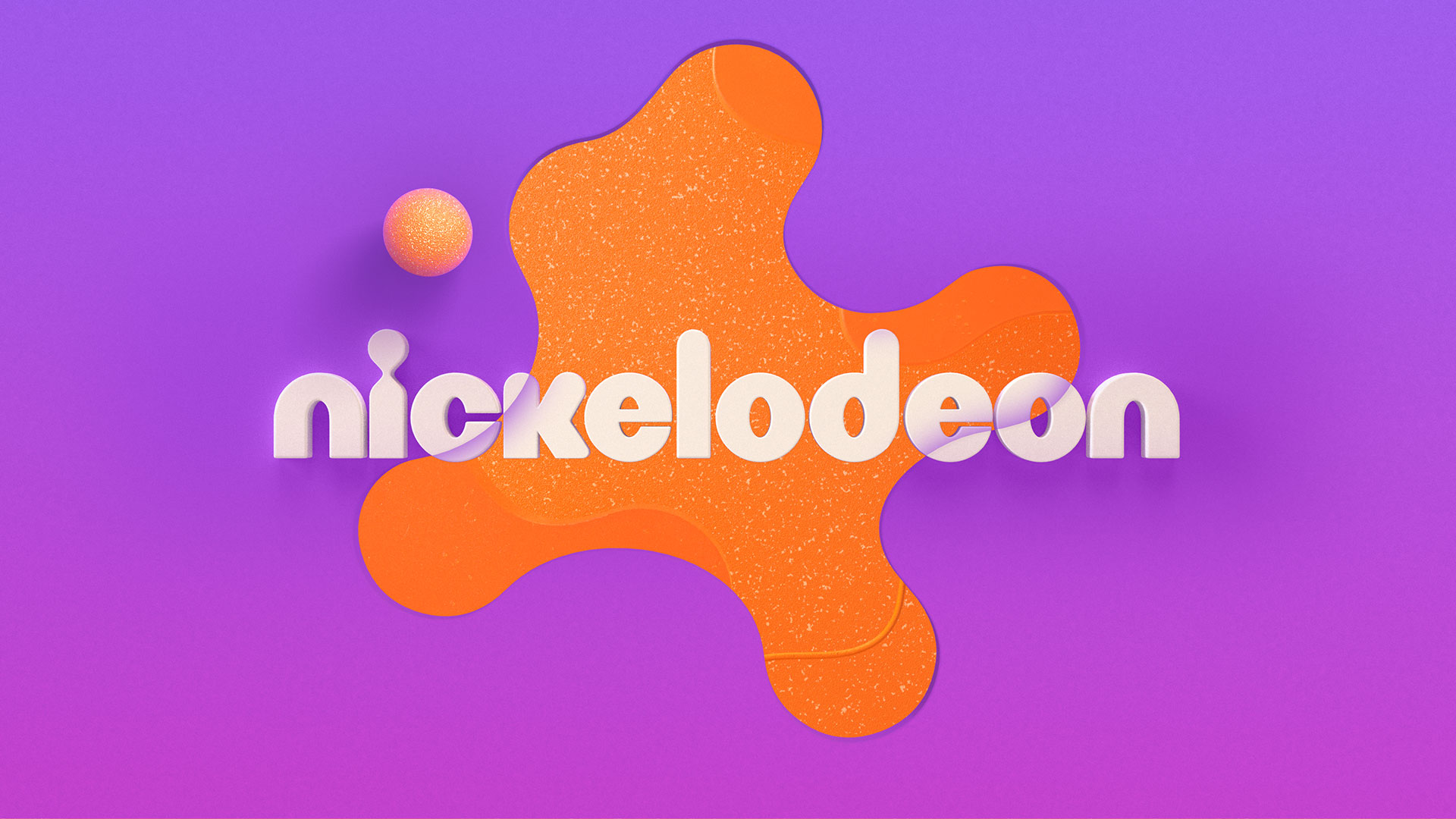
Roger worked with Nickelodeon’s in-house design team to devise a new Splat logo, contrasting type family and updated colour palette, designed to make the brand more cohesive.
LA-based branding and design agency Roger has collaborated with children’s television channel Nickelodeon on its first rebrand in 14 years, featuring a new version of its signature “Splat” logo that aims to unify its on-air, digital, and social brand identity.
Roger has been working with Nickelodeon since its early days as a studio. For this most recent project, Roger worked with Nickelodeon’s in-house design team on the core brand identity and deliverables and with other internal teams on design strategies for products, branded hotels and resorts, and attribution on various digital and subscription video on demand (SVOD) platforms.
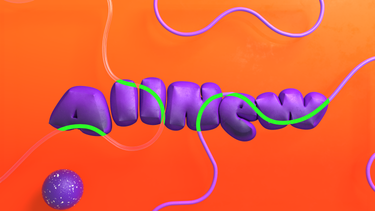
According to Nickelodeon senior vice president and global executive creative director Vincent Aricco Roger worked with the network’s internal creative and motion design teams to produce “a modernized visual identity that is the perfect marriage of innovative design and just the right amount of weird”.
The network continues to draw on its brand idea to “celebrate the inner child within everyone”, which Roger sought to convey through “a rounded graphic system imbued with vibrant colours”, says the studio’s founder and executive creative director Terry Lee.
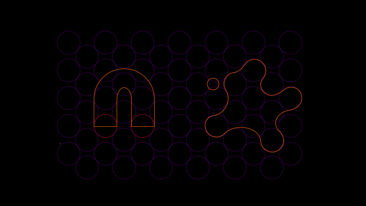
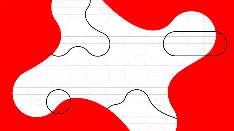
Nickelodeon’s new Splat logo was designed using a circular grid system. Lee says this meant that a secondary suite of splat shapes could be built on the same grid “to complement the hero mark with a natural cohesiveness”, according to Lee.
While the primary vision centred around ideas of “revisionism, randomness, and irreverence”, Roger creative director Braden Wheeler says the design language “needed consistency across every touchpoint of the Nickelodeon brand”. With his in mind, the studio aimed to design “a very accessible core to the visual identity”, he adds.
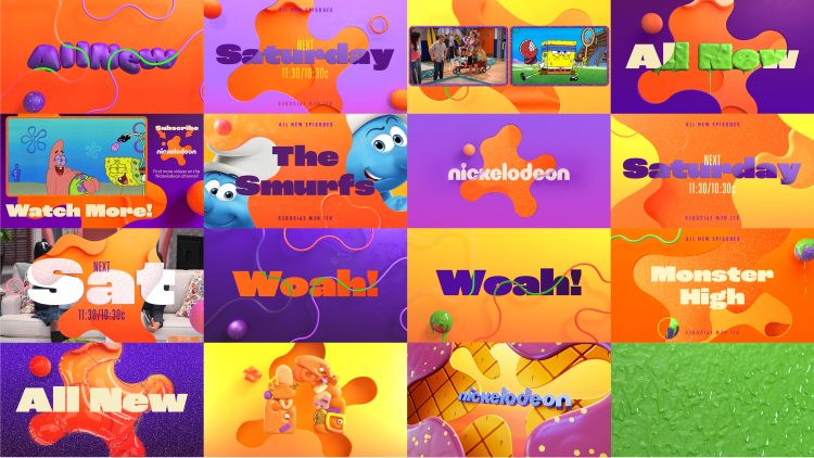
Roger opted to use ROC Grotesk and Neue Plak to make up Nickelodeon’s new type family. The former was chosen for its “subtle irregularity”, while the latter contrasts with a “more condensed style”, says Wheeler.
Calling back to Nickelodeon’s “classic animated style”, Lee explains how the motion design combines “traditional cell animation and modern 3D design”. By layering the “bold and clean typography” on top, Lee says that Roger looked to create a “contemporary look and feel” that pays homage to the network’s legacy.
For the live-action IDs, Roger wanted to convey “kids being kids in all their imaginative and messy glory”, according to Lee. To achieve this, the studio conducted shoots with real kids, giving them an empty canvas to paint murals, slurp noodles, or get their hands really dirty.
Much of the network’s visual DNA comes from its identifying bright orange. Though the orange has been retained as the primary brand colour, the new brand palette looks to “enter fresh territory” with additional hues of purples, yellows, and pinks, says Lee.
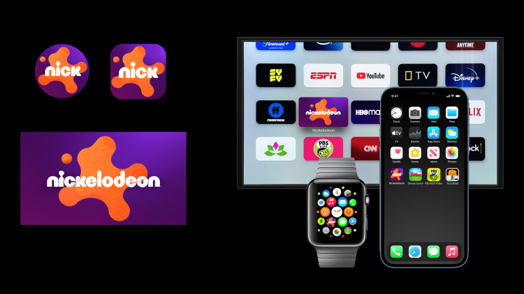
Wheeler explains how modularity was built into the design system, giving Nickelodeon “the flexibility to play in their sandbox and build upon the brand for years to come as new IPs and initiatives are introduced”.
Nickelodeon and Roger recently unveiled the rebrand work for Nickelodeon’s preschool audience, with new assets rolling out last week across digital and linear. The Nick Jr. channel rebrand is also due to launch in September.
The latter package centres around Nickelodeon’s orange Splat “with hints of Nickelodeon’s signature green slime around the edges” and features “a playroom theme and a wildly vibrant new palette”, says Lee. It also includes a new Nick Jr. logo lockup, new graphics, and animated idents.

This is a really awesome rebrand for Nick! I love the new look splat too, and the amazing colour palette, which brings a wide variety of gradients, and maybe even the option to customise them using the colour palette if needed.