DesignStudio gives Center Parcs Europe nature-inspired identity
In a bid to appeal to a new audience, Center Parcs Europe looks to its roots, embracing the relationship between nature and humans through its new identity.
DesignStudio has rebranded Center Parcs Europe as part of its broader strategy to reinvent itself as a holiday destination for all, not just families with young children.
The studio has devised a new brand story as well as Center Parcs Europe’s visual and sonic identities. According to Design Studio executive creative director Vinay Mistry, the key aim was to “change perceptions and evolve the brand” to suit existing Center Parcs Europe visitors as well as travellers who might not have considered visiting before.
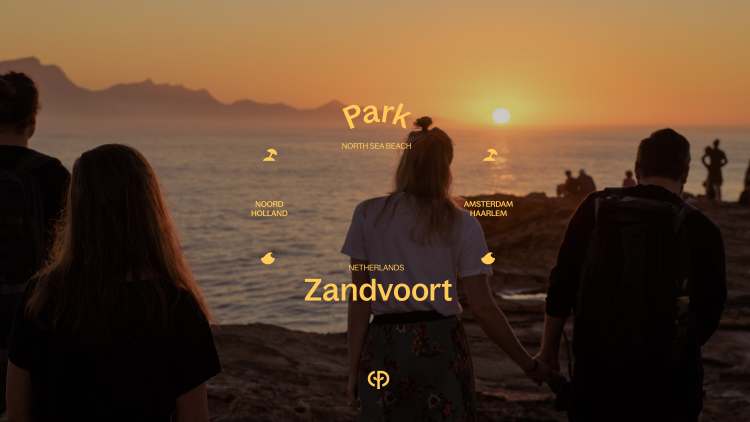
After visiting and experiencing the parks across Europe and delving into the brand’s archives as part of the research phase, Mistry says the team found that concept of “man plus nature” was the foundation of its identity. In an effort to take the brand back to these roots, DesignStudio focussed on this area as the “guiding vision to reimagine the Center Parcs Europe experience across every touch point”, says Mistry.
Central to the visual identity is a new CP device, which integrates a tree shape into the stem of a letter P. The whole lockup aims to combine three elements: Center Parcs Europe’s brand name, nature and humans. The outgoing identity featured a green leaf-like bird with Center Parcs written in in an italicised font.

The brand’s new typeface, Bagoss, is a sans serif font from Displaay type foundry. It was chosen for its “circular joints and organic terminals”, says Mistry.
Center Parcs Europe’s updated colour system is also informed by nature, in an attempt to move away from the obvious green. It now features “an eclectic, vibrant and flexible palette”, including “rich, warm colours” inspired by various qualities of the natural world, Mistry explains.
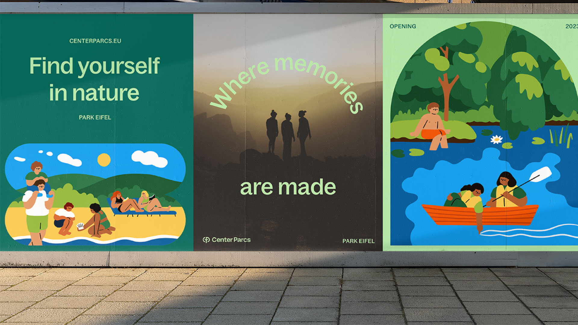
Irish illustrator Fuchsia MacAree created the brand’s charming new illustrations, which Mistry says “inject warmth, joy and a human touch across the system”. It is clear from the figures in the illustrations that effort has been made to represent people of all ages and races.
The bespoke photography also plays a key part in the new system, seeking to convey different aspects of the Center Parcs Europe experience, from “the quieter moments” to the “fun, the adventures, and the connection”, says Mistry. He explains how it does this by working across three tiers: “the textural closeups of nature, the real, candid shots of guests and the coming together of humans and nature”.
Aside from the aim of modernising existing parks and investing in new locations, Center Parcs Europe hopes to attract new and diverse groups with its new identity, such as friends, traditional, extended or blended families, and teammates or colleagues.
The new Center Parcs Europe branding is rolling out across its 29 Parcs throughout the Netherlands, France, Germany and Belgium.
I think the Mary Lewis logo for rowntree did this idea nicely