“From passive catalogue to active catalyst”: Natural History Museum’s new identity
The museum’s ambiguous new circular logo means it can be interpreted as anything from “a dandelion or a fossil to a collective of people or a school of fish”.
Pentagram and Nomad have designed a new identity for the Natural History Museum, with a graphic system that can be continually evolved using a generative tool.
The studios have been working on the project for two years following a creative pitch process that around 270 other agencies entered. According to Pentagram partner Marina Willer and Nomad founder Stuart Watson, the Natural History Museum has “a team of world class scientists in-house” so the studios were held to “a very high standard across the board” when creating the identity.
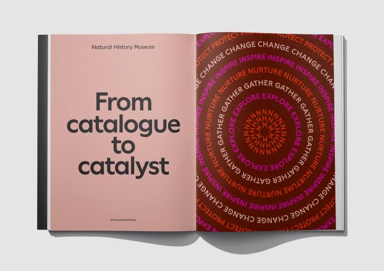
Brand consultancy Heavenly was responsible for devising a strategy to inform the visual identity, drawing on the idea of “a mindset shift from passive catalogue to active catalyst”, says Willer. While history is in the name of the museum, Watson says its new identity seeks to inspire visitors to “advocate for the planet”.
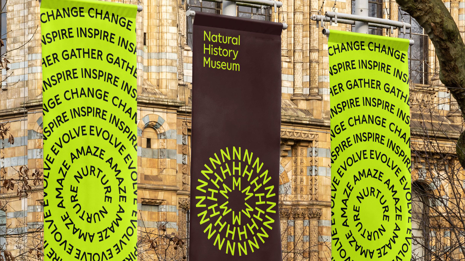
A key driver of the forward-looking strategy is the Natural History Museum’s new logo, which features the museum’s initials. Watson describes the symbol as a “positive and colloquial shortcut”, with Willer adding that it was designed to “reference the planet and the moment we’re living in”.
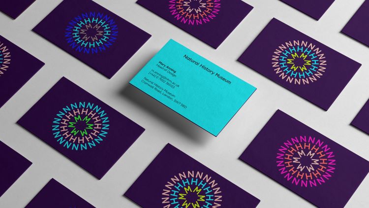
The circular shape aims to embody “a pulsating energy” says Willer, explaining how it reflects “the interconnection and circularity between everything in nature”. It can be interpreted as many things, “from a dandelion or a fossil to a collective of people or a school of fish”, she adds.
The NHM logo comes to life through four motion behaviours – ripple, grow, pulsate and orbi – each inspired by different aspects of nature. “As soon as we started to define the brand with the three letters, it was already moving in our minds and we were thinking as holistically as possible from the start”, says Willer.
Since the strategy repositions the museum as an “active catalyst”, Watson says the goal was to create “an active, motion-led brand”, which counters the fact that there are “a lot of dead animals and passive catalogues” within the museum itself. The logo is also reactive to sound, whether from animals or nature, which is represented through a combination of the four principles.
The behaviours have been coded into a generative tool, created with the help of coder Mat Hil. This will allow the museum’s in-house team to create new assets that align with the core brand principles. Watson says that the tool allows users to choose the “cadence, speed, principle and application” of the motion asset.
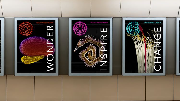
The Natural History Museum’s varied colour scheme has also been coded into the tool. Despite being a “multicoloured brand”, Watson says there are “a lot of rules and considerations” in place regarding which colours go together. Though the logo appears in different colours to represent the “diversity of nature and respond to any ecosystem”, Willer says its primary application is in the “beacon colour”, which is lime yellow and brown.
Yellow was used previously in Natural History Museum branding but Pentagram and Nomad sought to make it “more relevant for today”, she explains. The brown is “necessary” alongside the optimistic yellow as “it is present in so many things in the building” and relates to many aspects of history stones, dinosaurs and rocks, Willer adds.
Circular patterns also appear in the form of a single word, such as evolve or inspire, repeated in a circle formation. These graphic elements are not intended to be used excessively, but to “activate” messages that can be “more fun and loud”, sats Willer.
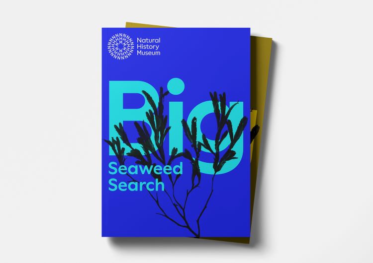
The wordmark typography was crafted by Patrick Giasson, and the brand typeface is a custom version of Wallop, by Displaaay type foundry.
Because of the shape of the logo, Willer says it was “quite tricky to create that configuration” when it came to the typeface. The museum’s internal team was also conscious about finding something “extremely legible and accessible”, she adds.

There are no words to describe the new NHM new identity.
It is beautiful, classy, straight to the point, and so much more..Great execution. BRAVI