Nice and Serious rebrands Areas of Outstanding Natural Beauty
The protected areas of land have a new identity system that allows each location to have its own personality while remaining part of “a living patchwork”.
Nice and Serious has rebranded Areas of Outstanding Natural Beauty, changing its name to National Landscapes and designing an identity based on the idea of “a living patchwork”.
Areas of Outstanding Natural Beauty (AONBs) are areas of land protected by the Countryside and Rights of Way Act 2000. According to the Government, they must meet certain criteria before attaining this status, such as having good landscape and scenic quality, relative wildness and tranquillity, and natural heritage features. Examples of these areas in England include The Cotswolds, Kent Downs and Norfolk Coast as well as Anglesey and Wye Valley in Wales and Causeway Coast in Northern Ireland.
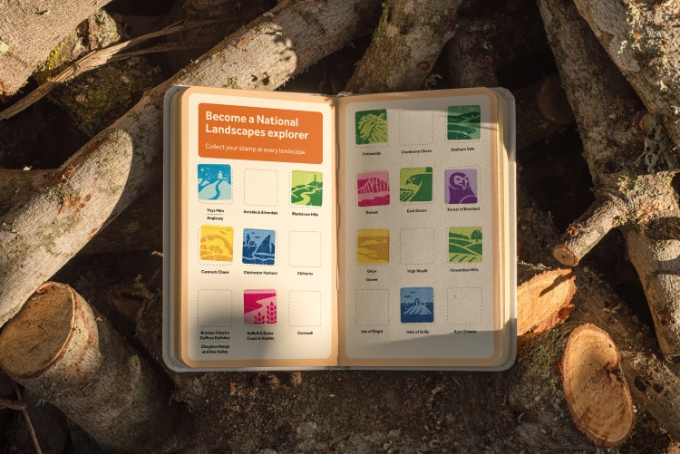
Despite 66% of the UK population living within a 30-minute drive from an AONB, awareness of these landscapes sits below 50%, according to Nice and Serious creative director Peter Larkin.
He reveals that several independent reviews recommended that changing the title to National Landscapes, “along with increased powers and resources”, would help them “better serve the nation”. The studio recognised that merging the entire network of 38 AONBs together “under a shared design system” would be challenging, but Larkin says the team had “a clear vision and ambition” for the project.
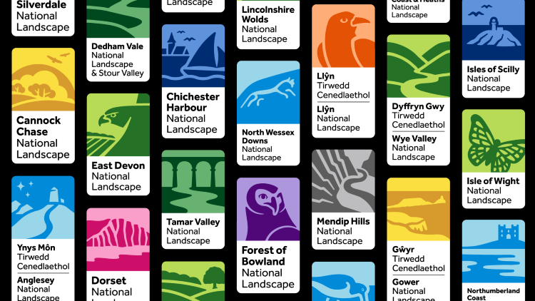
The new strategy focuses on “engaging traditionally underserved audiences” and communicating the “collective impact” of these landscapes at a national level, while remaining true to their “local personalities”, says Larkin. Research and exploration led the studio to a concept about “the unique interplay between people and the landscapes”, from which it developed a brand story centred around National Landscapes representing “the fabric of us”, he explains.
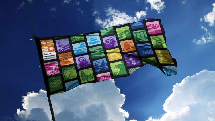
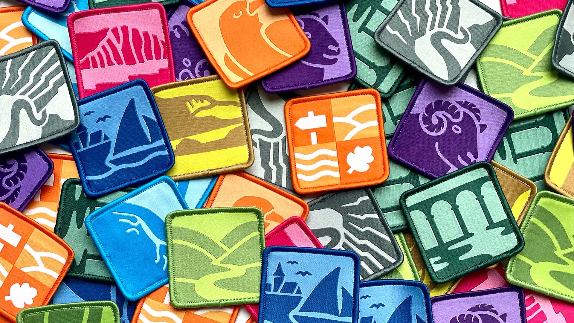
Larkin describes the identity as “a living patchwork, where each square is as essential and unique as each of us”. The squares are filled with various patterns of people and places, representing different types of landscapes and biodiversity.
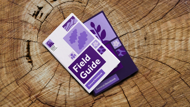
Nice and Serious opted for an illustration style inspired by “the natural imperfections” and “textural details” within the landscapes, says Larkin. He adds that the studio looked to avoid “cold, sharp edges”, instead embracing “natural deviations and curves”, resulting in a style that draws on the uniqueness of each landscape but also works in harmony when illustrations are patched together.
For the colour system, the studio looked the colours that dominate different landscapes. The palette ranges from “sandy dunes and rolling grasslands through to deep and vibrant moors and heathlands”, says Larkin, allowing each National Landscape team to choose the hue “most true to their local personality”. Each landscape’s palette was designed with guidance around accessibility in terms, considering levels of contrast for people with low vision.
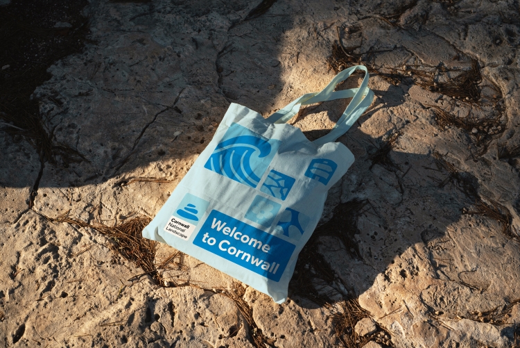
Nice and Serious chose Effra by Dalton Maag as the main brand typeface, “not only for its contemporary, humanist aesthetic but also its open characters, distinguishable letter forms and lack of mirroring”, which Larkin says makes it more legible for people with dyslexia.
The design work was informed by collaborative consultation work carried out by Human Rewilding Company founder and strategist Mark Sears and an internal steering group made up of people working in different areas and roles across the UK. Nice and Serious also consulted the entire network of 38 National Landscapes and an external Creative Council, comprising people representing underserved audience groups.
Larkin notes how the council’s input “helped shape the initial strategy” and explains how it was consulted at key stages of the project” to continually strengthen [the studio’s] approach to inclusivity”.
Having just visited an AONB (Arnside and Silverdale) and living just down the road from one that I visit often (Forest of Bowland) and being in the creative industries – seeing this fills me with joy. Good design is often design that already feels familiar and just ‘right’ for its purpose. A ‘nice’ approach to creating a brand vision for a series of ‘serious’-ly beautiful landscapes.