People People brings retro poolside aesthetic to Seattle restaurant Layers
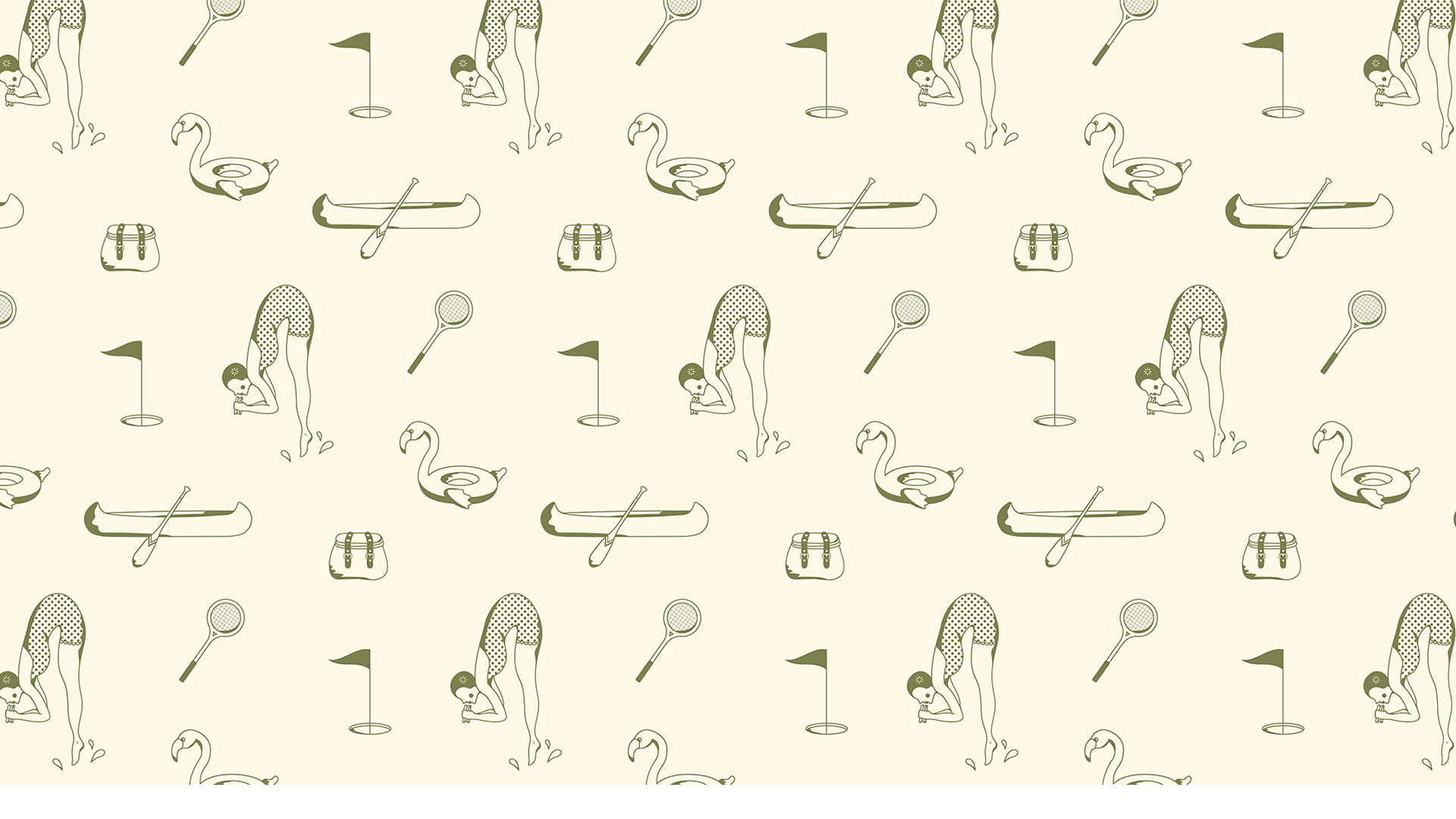
The sandwich restaurant aims to invoke memories of “lakeside summer camps, picnics and classic striped beach towels” through its suite of playful illustrations.
Seattle-based design studio People People has designed the visual identity for sandwich restaurant Layers, with varying wordmark styles and “nostalgic vintage” illustrations.
People People senior designer Maddy Porter got to know the owners of Layers after frequenting their popular food truck. When Layers signed a lease on its first restaurant space, it approached the studio to help it “make the leap” into the restaurant business, says People People creative director Shannon Palmer.
While many restaurants in Seattle “lean into a farm-to-table aesthetic”, speaking about the food and menu “in a very serious tone”, Palmer says Layers wanted to take another path. Instead, the identity looks to convey “joy, humour and playfulness” as well as the quality of the food, matching the atmosphere of the restaurant which Palmer describes as “friendly and casual”.
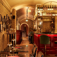
Layers’ new space is directly across the street from Seattle’s Green Lake Park. Layers and People People wanted to tap into the “nostalgia and carefree feeling that people associate with lakes during the summer” through the brand identity, says Palmer.
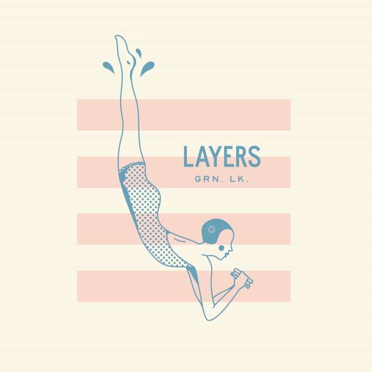
She notes how there has been a “growing trend” for products and companies to have “a suite of logos” that can be used interchangeably, depending on application and audience. People People took this approach with Layers, choosing sans-serif font Highway Gothic – which was developed by the United States Federal Highway Administration and used for road signage in the Americas – and script font Holiday Park designed by Chez Núñez.
The “minimal” sans-serif is used for signage and the menu “where readability is paramount” while the script logo, which Palmer says has a “retro, poolside, slightly country club feel”, is reserved for “more playful brand moments”, like on merchandise and the website.
Porter designed the brand illustrations in-house. Like the overall identity, the illustrations aim to take on a “modern but nostalgic” aesthetic, with each incorporating monoline elements, pattern and shadowing to give them “a warm, mid-century, hand-drawn feel”, according to Palmer.

She says the design team took influence from “summer camp shirts from [their] childhoods” that featured “single-colour screen prints”. The aim was to nod to this “without feeling too theme-y” or referencing “a specific era”, explains Palmer.
The content of the illustrations is inspired by the lakeside location of the restaurant and Layer’s sandwiches. Wherever possible, People People tried to playfully combine the two, says Palmer, depicting a woman diving while eating a sandwich or a sandwich floating along like a boat.
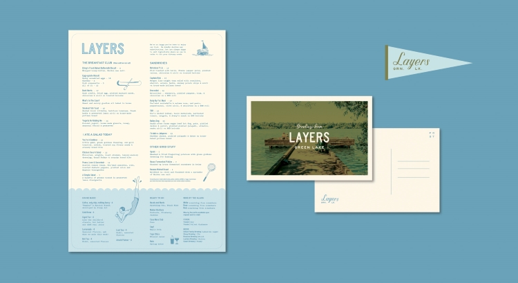
Designing the menus, signage, interior graphics and merchandise was also in the studio’s remit. As with the illustrations, Palmer notes how the menu designs and apparel seek to invoke the “free feeling that summers had in youth and still have in adulthood”, triggering memories of “lakeside summer camps, picnics, row boats, diving boards and classic striped beach towels”.
Palmer says: “We joked with the client, asking ‘If Wes Anderson’s Moonrise Kingdom featured a lakeside sandwich shop, what would it look like?’”
Unfortunately there is nothing about the identity program that would entice me to eat at this sandwich shop. The design brief seems misaligned with the actual business.