Soapbox refreshes brand and website for The National Centre for Social Research
The type-led identity and new website looks to foreground the organisation’s purpose as well as key findings from its published research.
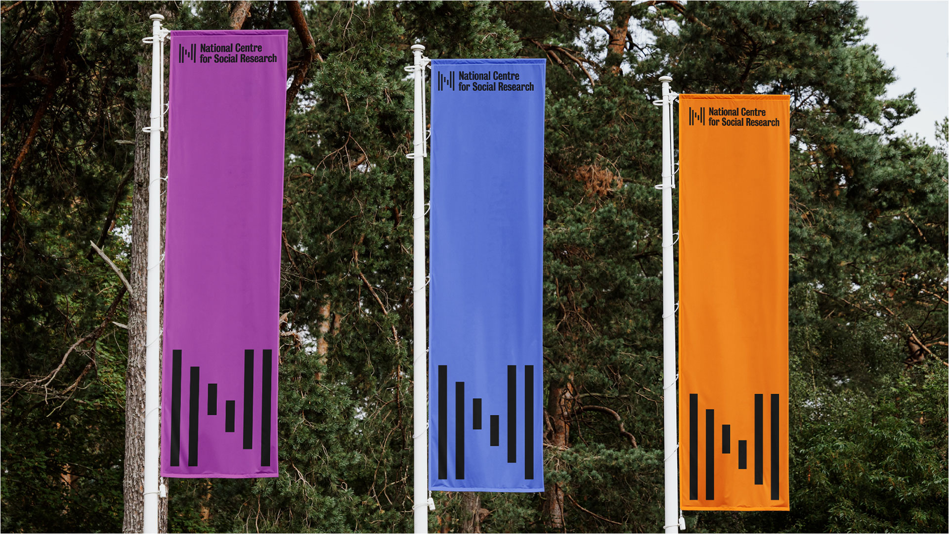
London-based design firm Soapbox has refreshed not-for-profit The National Centre for Social Research’s (NatCen) identity and website, with a logo made up of data bars and lead typeface linked to “the history of public communications”.
NatCen is a registered charity and the largest independent not-for-profit social research organisation in the UK. Its role is to collect, analyse and present evidence, and ensure that public opinion on social issues informs policy and change.
The design work coincides with the introduction of “a new organisational strategy” devised by NatCen, led by its ambition to become the most prevalent social research centre, says Soapbox strategy lead Naomi Isaacs.
Through early research, Soapbox found NatCen to be a “thoughtful and fiercely independent organisation” and so the studio looked to other “British post-war institutions” like the National Theatre and the Open University for inspiration, according to Isaacs. Since NatCen works “at the intersection of data and society”, she says it was important for the identity to “depict facts and statistics with bold clarity” while representing “a broad spectrum of life”.
Motion-enhanced data bars make up the brand symbol, which forms an N when static. It was designed to represent “the changing landscapes within which NatCen works”, says Soapbox senior brand designer Guy Grimshaw. He adds that the system allows for the Scottish Centre to have “its own custom S to stand proudly behind, with the two tied together through the same visual language”.
Grimshaw describes the biggest challenge as “finding the right point between evolution and revolution” as the studio has to retain “the core visual essence of NatCen” while giving it “a new lease of life”. Through its own initial research and a workshop with NatCen, Soapbox observed two things: “the need to focus on typography as a design feature, and to retain a broad colour palette”, says Grimshaw.
“Typography plays an essential role in NatCen’s communications”, adds the studio’s head of web and brand design Esa Matinvesi, however its old typeface, Helvetica Condensed, “lacked a connection to the brand”. Soapbox sought to draw a link between “Britishness and the history of public communications”, so it opted for Bureau Grot as a lead typeface, described by TypeNetwork as “the essence of tooth and character in an English 19th-century sans”, Matinvesi explains. Colophon’s Fann Grotesque was chosen as the supporting typeface.
Recommended: Design Bridge and Partners refreshes Cancer Research UK identity

Soapbox worked closely with NatCen on guidelines and templates, says Grimshaw, “providing clear rules on the practical and accessible use of colour, typography and infographics, as well as setting the course for a more human, authentic photographic style”.
Grimshaw thinks that, like most organisations, NatCen’s website is “the most visible and important public-facing aspect of its brand”, and so it was important that “even the most practical elements, such as a search icon, connected to the wider visual identity”. He felt the Bureau Grot typeface was “a logical starting point for the icons”, drawing on it for “beautifully expressive” glyphs.
Recommended: WMH&I rebrands Inspire to help the education charity open doors
Soapbox rebuilt NatCen’s website in a bid to make it fully responsive with a site structure that “helps NatCen to better communicate who it is and what it does”, says Grimshaw. “Impact” was a key consideration, and the studio was keen to display “key findings from NatCen’s regularly published research” on the site, according to Grimshaw.
The site includes a tool that transforms content from a webpage into a designed PDF document and focuses on “clear space and effective typographic hierarchies” to help the user discover relevant content, he explains.
While colour is used “in moderation to top and tail the pages” and for “key to action modules and cards” Grimshaw says the search functionality “takes over the screen to put the focus on what the user is looking for, as well as the beautiful typography”.
-
Post a comment
