Royal Mail reveals 2023 Christmas stamps that nod to “old carol books”
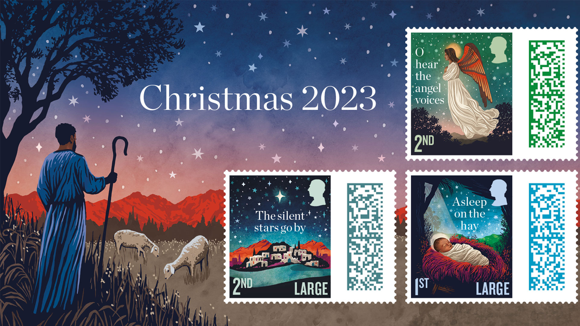
Each stamp features lyrics from a well-known Christmas carol and was created with watercolour to add “depth and richness”.
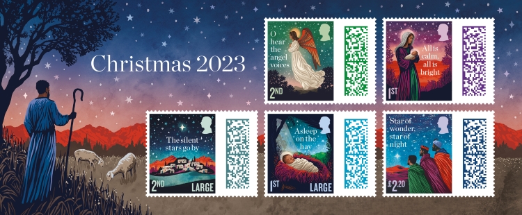
Royal Mail has unveiled its set of five Christmas 2023 stamps, designed by Steers McGillan Eves and illustrated by Tom Duxbury to nod to “old carol books”.
The stamps are the first to feature the silhouette of His Majesty King Charles III and the brief detailed that each design must depict the nativity and feature lyrics from five well-known Christmas carols. The five carols are O Holy Night, O Little Town of Bethlehem, Silent Night, Away in a Manger, and We Three Kings, and were pre-selected by Royal Mail.
Steers McGillan Eves decided that the designs should be “nostalgic” and reminiscent of “old carol books”, so started looking for illustrators who had worked with woodblock and lino printing techniques, according to its co-founder Christian Eves.
Woodblock printing is a relief print technique in which images, designs, or words are carved in reverse onto a block of wood using carving tools. The image is then inked and printed onto the illustrator’s chosen material. Similarly, lino printing involves carving a pattern or design into a linoleum, rubber or vinyl surface before printing.

The challenge, says Eves, was finding illustrators with a style that was compatible with text, so he started by walking around bookshops to look at covers that work well, which he says is “a good test for type and image”. It was during one of these visits that he came across West Yorkshire-based illustrator Tom Duxbury, who specialises in woodblock printing and has worked on many book covers, including Philip Pullman’s Serpentine and The Collectors.
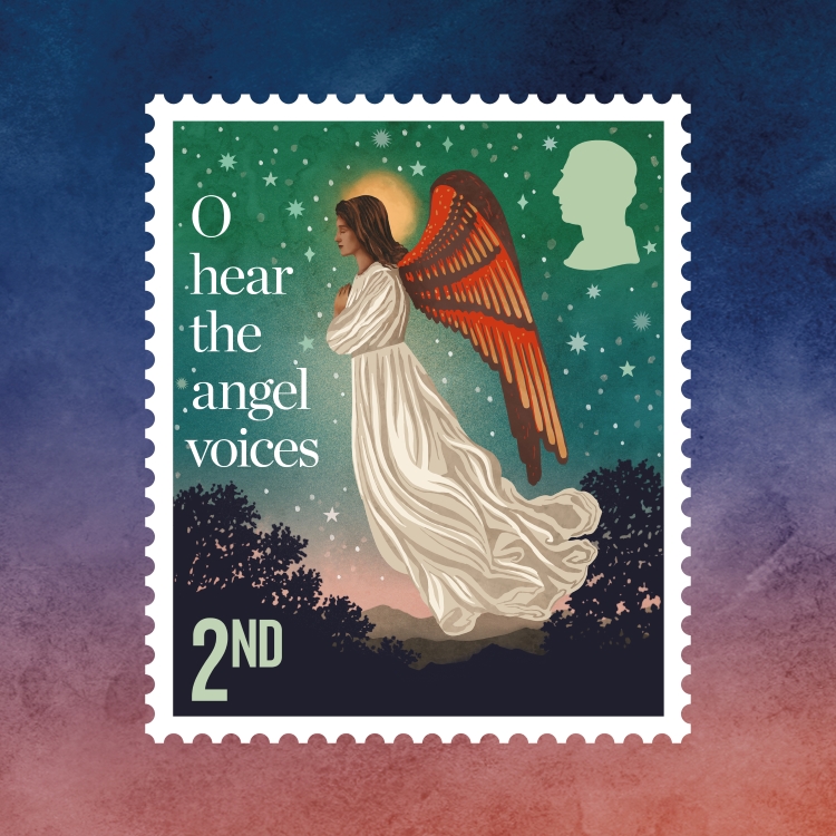
Devising a way to “weave the lyrics” into the nativity scenes on the stamps meant exploring “lots of different compositions” in the early stages, says Eves. Some versions “dialled up the lyric” with a more “passive” illustration but Steers McGillan Eves eventually decided on a more “balanced” approach that didn’t look “too busy” next to the barcode, he explains.
Since the nativity is “weighted by so much history and iconography”, Duxbury says he had to “strip it right back and tell the story quietly”. He notes the simplicity of the stamps, adding that it felt “unnecessary to capture the narrative in any other way”.
Read more: Royal Mail 2022 Christmas stamps embrace “jewel-like” aesthetic

When drawing them, Duxbury explains how he drew on the feeling of “being out in nature at night” and subtly incorporated “hints of the landscape” where he lives on Bingley Moor.
Steers McGillan Eves went through “a lot of trial and error” when choosing the typeface before landing on Chronicle, which Eves describes as “a modern version of Caslon”. Chronicle was released by Hoefler & Co. in 2002 and is defined as a Scotch, which is a style that originated in Scotland at the end of the eighteenth century.
Read more: Royal Mail 2021 Christmas stamps tell a “contemporary” Nativity story
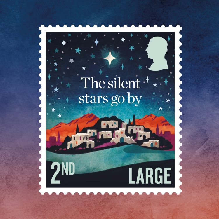
Eves also says there was a “careful consideration of making things feel appropriate”, meaning that “scenes had to look like Bethlehem” and skin tones had to be accurate. The brief also said that the lead colour of the stamp should match that of the barcodes, which link to videos created by Aardman studio that feature Shaun the Sheep and his friends.
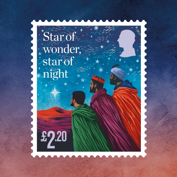
Duxbury created a colour palette that features across each stamp to make it look “cohesive” as a set, says Eves. While his process usually involves lino-printing, Duxbury says his first attempts with this method “weren’t translating well at stamp size” so he chose to move into watercolour “to create that depth and richness of colour that was missing from [his] initial illustrations”.
For this, he used a little wooden box of watercolours that belonged to his late mother, who passed away in 2020. “When these artworks were selected as final designs it felt like a very special collaboration with her, full of magic and nostalgia”, he says.
-
Post a comment
