Pepsi’s new logo takes influence from its 90s predecessor
Electric blue has replaced the muted tones seen in Pepsi’s previous identities, while the addition of black spotlights the brand’s Zero Sugar offering.
Pepsi has unveiled a new logo and visual identity, “borrowing equity” from its history and merging it with more modern touches, ahead of its 125th anniversary this autumn.
This is the first time that Pepsi has updated its well-known globe logo since 2008. The new identity was created by PepsiCo’s in-house design and innovation team.
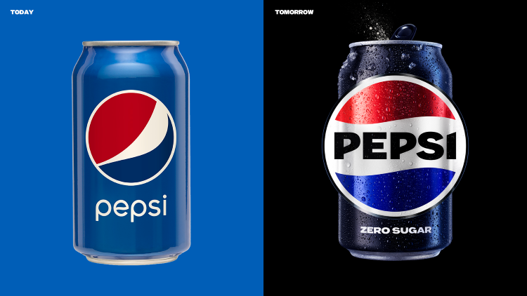
PepsiCo senior vice president and chief design officer Mauro Porcini says that the new brand identity aims to “connect future generations with the brand’s heritage” by integrating distinctive historical markers of the Pepsi brand with “contemporary elements”.
The new Pepsi globe and wordmark bears similarities to the version used between 1987 and 1997, but uses a different font, font colour and slimmer border. It has been designed to work in a variety of settings and emphasize the distinctive Pepsi branding that most people recognise.
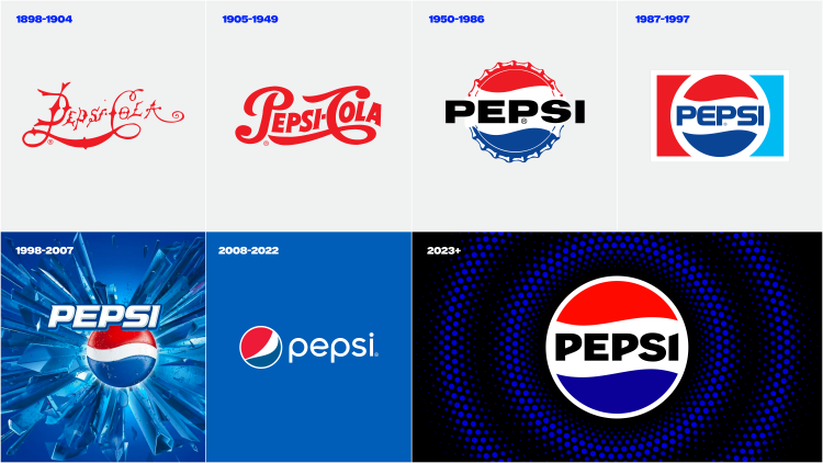
In the previous logo, the wordmark was lowercase and separated from the globe logomark. Now the wordmark appears in uppercase letters and sits within the central white stripe of the logomark.
As for the colour palette, the PepsiCo says it introduced electric blue and black “to bring contrast, vibrancy, and a contemporary edge” to the classic Pepsi hues. The increased use of black in the logo acts as “a growth driver” for the Zero Sugar range, according to PepsiCo, better connecting it with the Pepsi blue across the brand.

Pepsi’s new typeface is called Pepsi Owners, which is a customized version of the Owners typeface. Porcini says that it has “the right balance between nodding to a familiar look and feel on one side, and projecting the unapologetic energy and dynamism of the brand on the other”.
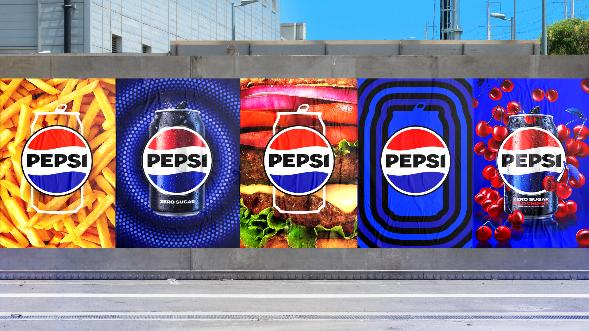
In a bid to position Pepsi as a brand accessible to all, a new visually distinct can silhouette has been added to its suite of graphic assets.
To keep up with the increasingly digital world, movement and animation have been introduced into the visual system in the form of the Pepsi pulse, which Porcini describes as “a living and breathing design asset”. PepsiCo says the pulse evokes “the ripple, pop and fizz” of Pepsi-Cola and “brings the rhythm and energy of music”. The design team adds that the pulse aims to facilitate “more flexibility for Pepsi to move between physical and digital spaces, from retail shelves to the metaverse”.
Porcini says: “At PepsiCo, we design our brands to tell a compelling and holistic story. Pepsi is a shining example of a brand that has consistently reinvented itself over 125 years to remain a part of pop culture and a part of people’s lives.”
The food and beverage giant also rebranded 7UP earlier this year using a similar strategy which drew attention to its sugar-free offering and featured more motion graphics.
The new Pepsi logo and visual identity will roll out this autumn in North America, followed by a global rollout in 2024.
Great Job. No question
Great improvement, the previous one was awful. Interestingly they went back to the 90’s version, like many other brands. Nothing wrong with that, but poses the question, have we run out of ideas? Was the 90’s a more regimented and lasting approach to design solutions?
That 87-97 graphic is a real beauty.
Bugger the logo (which is crap anyway). The fact is just one or two colas a day could increase the risk of type 2 diabetes by more than 20%. So it’s better not to give Pepsi or any cola companies the oxygen of publicity. Visit Mexico to see how many children have been affected by consuming Coke and Pepsi literally fed from a baby bottle. It is shocking.