Presidio Park rebrand references classic US national park posters
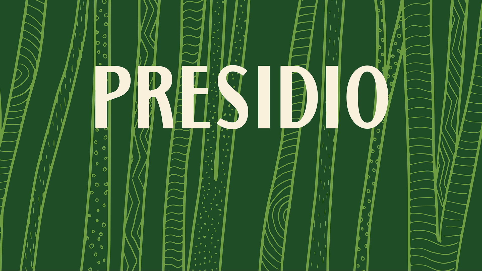
MacKenzie’s new visual identity for Presidio national park in San Francisco includes bespoke graphic illustrations inspired by flora, fauna and architecture specific to the location.
San Francisco-based creative agency MacKenzie has rebranded national park site Presidio, which includes a new logo inspired by vintage signs and WPA (Works Progress Administration) posters.
The WPA scheme, which ran from 1935-43 employed 8.5 million people on state projects, many of which were communicated through posters. This included the promotion of national parks.
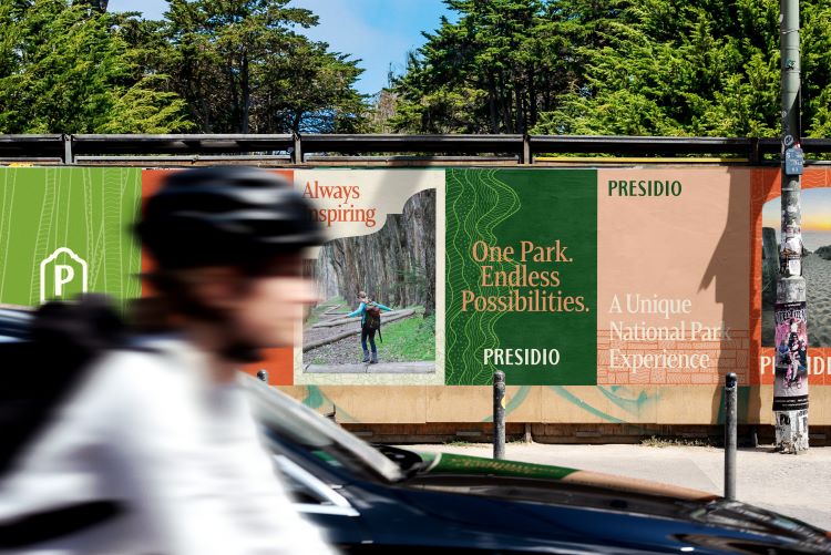
Unlike other national parks, Presidio is integrated with the city and while it is a place of natural beauty, it is also a place which joins up with neighbourhoods and abuts the Golden Gate Bridge. Due to the park’s location and broad stakeholders, MacKenzie’s lead brand designer James Van Kriedt says its visual identity system has to resonate with “different audiences and allow for different applications and experiences”.
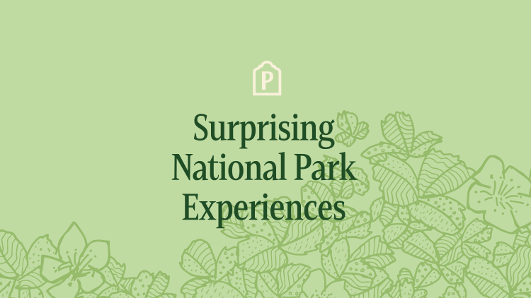
This ties in with the wider brand strategy, which is to unify the park’s “historical, cultural, recreational and tenant offerings” and strengthen its proposition of “surprising national park experiences” for an urban audience, according to MacKenzie’s executive vice president Daniel Hutson.
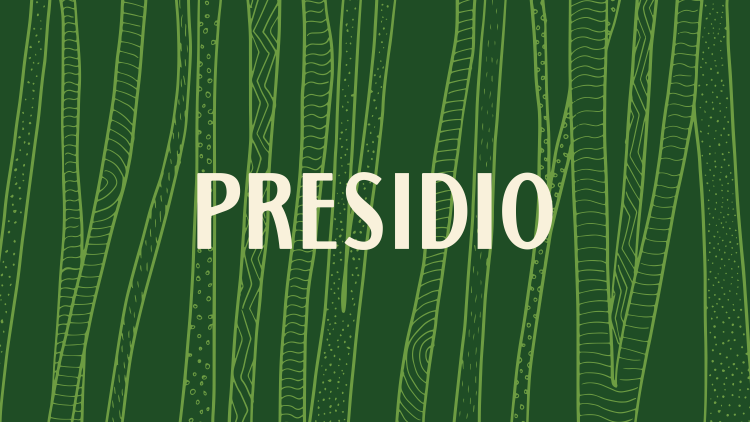
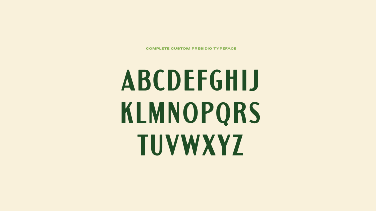
Presidio’s logo features “unique letterforms” that seek to combine “bold and modern touches” with the style of vintage national park signs and WPA posters from the early 20th century, says Van Kriedt. Taking influence from existing National Park assets means Presidio can adopt its own identity while remaining cohesive with the wider National Park Service brand. Van Kriedt adds that the inclusion of the vintage style symbolises Presidio’s” commitment to preservation”.
The custom typeface featured in the wordmark is called Presidio and also appears in lockups “within the broader monolithic brand system”, says Van Kriedt. This includes the Presidio Trust, Presidio Residences, Presidio Commercial, and Presidio Golf Course.
“Selecting and developing the brand’s graphic patterns was a time-consuming process, from ideation to design”, says Van Kriedt. MacKenzie sought to highlight Presidio’s individual personality through a custom library of illustrated patterns. Van Kriedt explains how the six approved graphic patterns are inspired by “natural and historical elements present throughout the park”, such as the Cypress Forest, ocean shoreline, Raven’s manzanita, beach strawberry, brown pelican footprints, and brick.
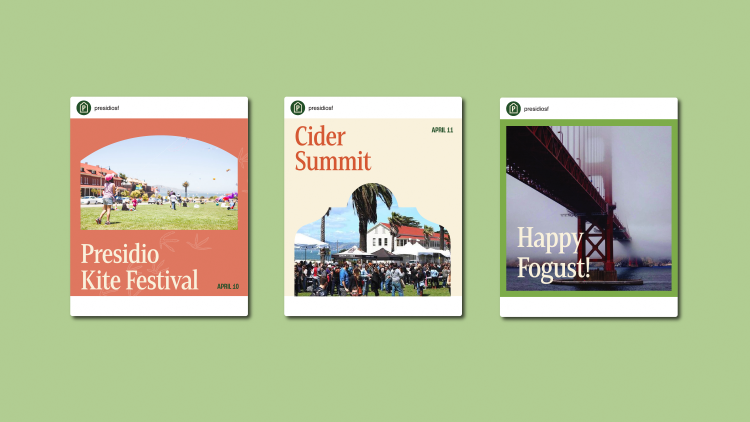
Presidio’s custom image frames take inspiration from Presidio’s classic architecture, such as arched doorways and rounded roof parapets. Framing the photography, they act as “windows into some of the many experiences available to park visitors”, says Van Kriedt.
He adds that Presidio’s “tertiary P icon” seeks to pay homage to “the illustrated Fort Winfield Scott building” featured in the previous Presidio Trust logo.
The new colour palette comprises four hues also inspired by the park’s nature and architecture: cypress green, Baker Beach white, Crissy Field green and rooftop red. Van Kriedt says the secondary palette “leverages tints of the primary colours, allowing for flexibility in usage and depth in compositions”.
Hutson says that the initial brand rollout has included “updates to the Presidio website, social media, employee apparel, and select signage, with a wrapped shuttle coming soon”. The next stage in the rollout process might include branded merchandise, environmental graphics, vehicle liveries , and activations across key attractions.
-
Post a comment
