Making the “infinite” crowd-sourced People’s Graphic Design Archive
The team behind a new crowd-sourced repository of graphic design went online and on the road to let the public define graphic design history.
It was while “in the weeds” of producing her book Earthquakes, Mudslides, Fires & Riots: California and Graphic Design, 1936–1986 – an expansive project documenting a body of graphic design so different to its East coast counterpart – that Louise Sandhaus, graphic designer, design educator and author started thinking about creating an open-source graphic design archive.
The further she went into the history of Californian graphic design, the more it became clear that its unique culture wasn’t just the story of a few key individuals; it was one belonging to “a huge amount of people who had different points of view and different interests”, Sandhaus says. But the full breadth of a narrative that “could go on forever” wasn’t going to get published; even the book itself, a 420-page tome, took eight years to find a home.
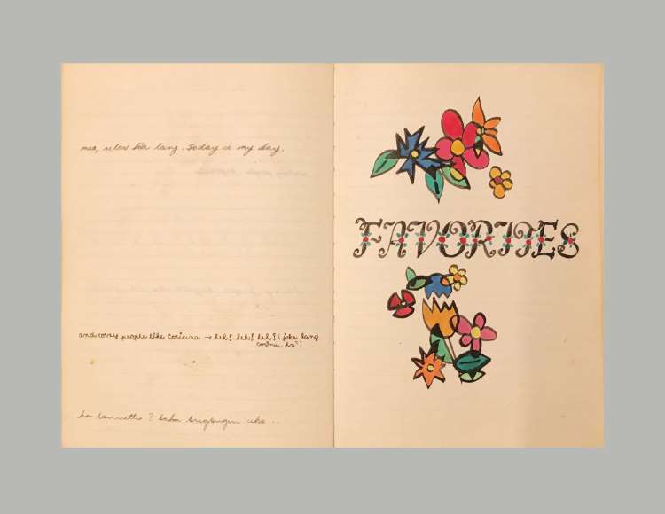
Looking at her own research, and a similar abundance of material unearthed by former student, Silas Munro, on the work of W.E.B Du Bois, she wanted to find a way to preserve material such as this and have it publicly accessible. “And so that’s when it dawned on me: OK, let’s have a crowd-sourced virtual archive,” Sandhaus says. “And I was like a dog with a bone […] I just kept going with this idea.”
What became The People’s Graphic Design Archive (PGDA) was formed over eight years by Sandhaus and the three other co-directors: Brockett Horne, Briar Levit and Morgan Searcy, as well as a wider team of advisors.
Early iterations were tested and modelled with Sandhaus’ students at California Institute of the Arts (CalArts); then in 2020, the co-directors reached out to the team behind another crowd-sourced virtual design collection, Fonts in Use , who advised them to launch a prototype in wiki software Notion, which they did in January of this year.
The site as you see it today, launched on 1 September, was created by designer Abby Chen and developer Rob Meek, who was also the developer for Fonts in Use.
Designing the archive

The top left corner of the site reveals a title shifting between types – itself a reference to the polyphony of a crowd-sourced archive – with type belonging to different eras and places.
Each time the homepage loads it refreshes to show a different selection of the archive’s contents – which might include original artwork, photos, letters, audio recordings of oral history, videos, essays and more, as well as links to other archives or websites.
From here, the search bar at its top allows users to search by title, format and credits, or you can sort by date, contribution date, most viewed or – making the most of the communal element of the project – most discussed.
In green, on opposite corners of the page are two more calls to act: Add to Archive positioned top-right and Donate, bottom-left.
“Preservation, not perfection”

The success of a crowd-sourced archive is determined by the willingness and ability of people to contribute to it. The site’s resources are a vital and refreshing element, featuring simple tutorials for adding to this site and for archival work more generally, such as Adding to the Archive, Documenting work fast & easy, Conducting an interview fast & easy, Archiving fast & easy and Tagging 101.
“[We realised] how low the threshold was for people actually contributing in a crowd-sourced way”, Sandhaus tells me. “[If] you put too much in front of them, they will run.”
The tutorials are undemanding: one on photographing work provides both useful tips for lighting best practice while reassuring potential contributors that their phone camera will be sufficient. “It doesn’t have to be perfect; our motto is preservation, not perfection”, Sandhaus explains.
A facility for commenting on archive contents both for the original uploader and later users also enriches the project. The hope is that a community will build through this discursive element of the site; anonymity is permitted for those who need it – due to societal restrictions or personal situation – but it is discouraged.
Not just online, but on the road
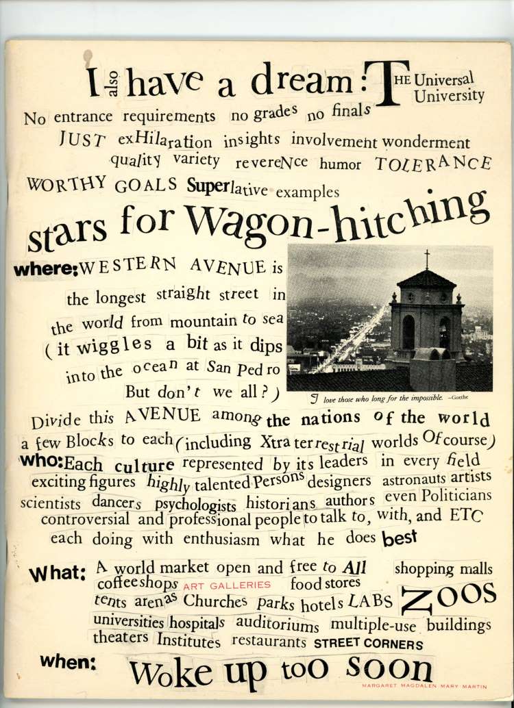
Although a virtual archive, much of the work of building it happens on the ground. For this, the PGDA came up with the idea of Graphic Design Roadshows, modelled on the (US) version of the popular TV show, the Antiques Roadshow.
The first of these, held in September, was linked to the exhibition, Torn Apart: Punk, New Wave + the Graphic Aftermath, 1976 – 86, inviting people to bring Punk and New Wave posters, flyers, tickets, zines, T-shirts, album art and more. At the shows, people can bring items that they “may have stashed away and just want to bring to light”, hoping to find others who might recognise it or tell them more about it. At the roadshows there will be people with knowledge around the subject on hand, able to provide “factual data” about items.
Another initiative is a series of Add-a-Thons, an online Zoom event aimed at specific communities or tied to events, where people come together in a limited time period to add things to the Archive. The first, taking place in October, will be a Latinx Add-a-Thon hosted by designer Ramon Tejada.
“We’re not the arbitrators of what’s graphic design or not”
From the outset, there was a desire to look beyond academia and canonical conceptions of graphic design, asking “what would citizen scholarship look like?” The central idea is that everyone should have a say in determining how graphic design is understood, and what of its history is preserved.
Moderation is kept to a minimum, with current moderator, co-founder Briar Levit, not doing “much more than pushing the button” to upload content Sandhaus explains, but issues do come up: “Say somebody uploads a picture of a chair”, Sandhaus says. “So we’re like, ‘OK, well, how are they seeing this as graphic design?’ Because this is a collective definition of graphic design. We’re not the arbitrators of what’s graphic design or not.”
One of the archive’s most vital features – albeit one with teething problems such as duplications and misspellings – is tagging. “What I want to emphasise is that things mean differently to different people, and the richness and the vitality of what is on the site depends on the tagging”, Sandhaus says. “We really hope people go nuts – like we see on Instagram [where] people madly hashtag.”
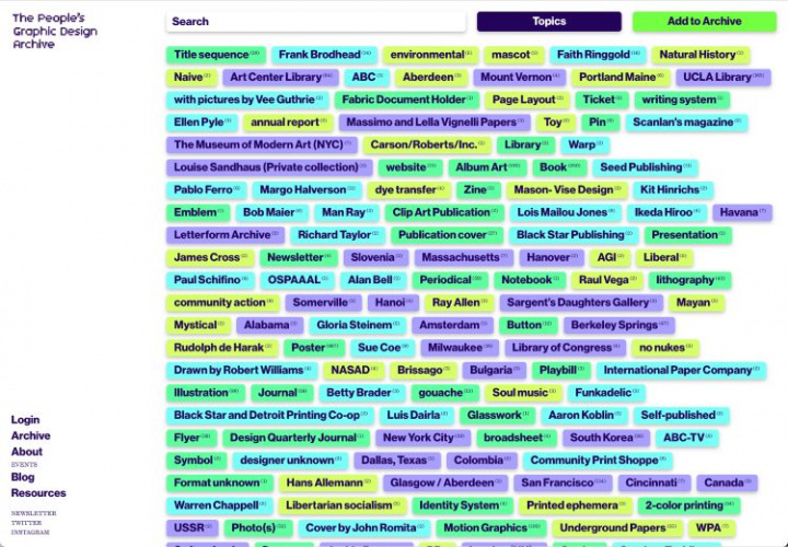
Unfortunately, contributors are still reluctant, something PGDA hopes to improve with its Tagging 101 resource. “Yes, we can tag it ourselves,” Sandhaus says, “but we don’t know what it meant to the person that uploaded it […] what they notice about it – and this could be formal qualities or historical qualities or contextual qualities – whatever it is that gives the thing meaning.”
Any messiness, however, adds some serendipity into the experience of using the archive, where surprises might turn up and unexpected connections might be made between items – allowing new stories to emerge and a “more complex history [will be] revealed”, Sandhaus says.
“History is infinite […] there’s no end goal”

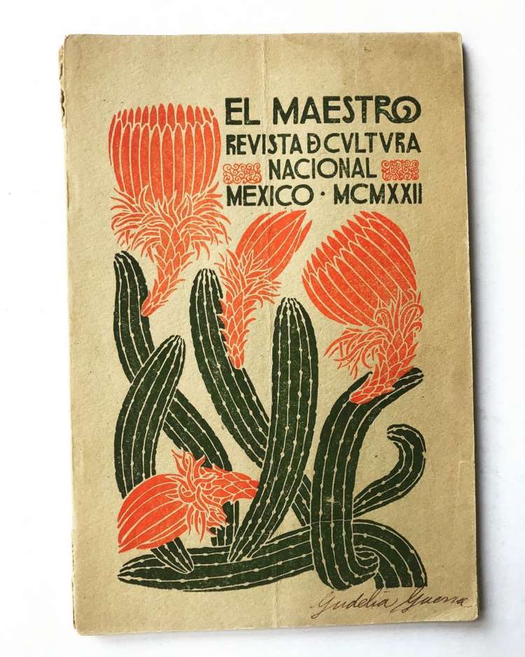
If, as Sandhaus, suggests, just the story of California could “go on forever” it’s hardly surprising that the PGDA is expansive in its scope and ambitions. Due to a lack of similar resources to preserve graphic design history, the project has no geographic limits and welcomes items in its collection such as a beautiful 1922 book cover from Mexico, or a collection of Scottish newspaper clippings uploaded by one user. Sandhaus mentions how for one Chinese student of hers, the project’s validity was established when he saw it come up on a WeChat feed. There is a plan for different-language versions of the archive to be established in the future.
Eight years in, the project is still in its infancy, but in various ways it is spawning new projects and new knowledge. Roadshows have brought up treasures, such as a “stunning” never-before-seen Corita Kent work, Sandhaus explains, while many more overlooked histories of graphic design are also coming to light.
Another key userbase for the Archive is design educators, and given the co-founders academic backgrounds, this has been another key consideration. A number of resources on the site show how the Archive could be utilised by teaching programmes and students, and Sandhaus will be presenting the project at the next AIGA Design Educators Conference in Seattle.
“You know, I like to think of the history as infinite; the way people will use it is kind of infinite. There’s no end goal”, Sandhaus says.
Banner image: CalArts Spring Music Festival (poster), designed by Caryn Aono, 1996


It’s a very interesting story and article, and “unbeatable” is the word that comes to mind when reading this article. I do a little bit of design myself, namely the creation of phone icon vector , which I am very proud of and want to progress in this area, exploring other areas of my activity. This article broadened my horizons and showed me how to do my job to the fullest, to the maximum, then you will get the desired result.
Cool history, amazing story)