Design, Climate, Action: Sustainable products’ branding must not show “nature is weak”
Despite demand for sustainable products, consumers still have misgivings about green brands. How do designers approach the problem?
There’s an odd tension at the heart of the sustainable market. According to one survey, while 65% of consumers say they want to buy sustainably-driven brands, only 26% actually do.
This can partly be explained by the origins of sustainable product branding, according to Among Equals founder and strategy director Oliver Burch. The sector has been consistently communicated as “less than or not as good as” more traditional products, while people are used to the idea that it is “soft and gentle and caring”. With those pre-conceptions, it’s easy to understand why consumers’ actions don’t match up to their intentions.

He believes these branding clichés date back to the late 90s, when the idea of a “green consumer” was identified. “This was always going to be a niche,” Burch adds, and as climate issues became mainstream, eco-tropes were applied widely and without much thought. Hallmarks include a familiar shade of what he calls “sustainability green”, language about Mother Nature, and other traditional feminine cues, he explains. “There has been an idea that nature is weak and soft and we have to care for it,” Burch adds. “We would have a little leaf with dew drops and so on.”
One break-through was Tesla. Before the arrival of the electric vehicle (EV) brand, the message was that EVs were just not as good as a car with a combustion engine, Burch explains. “Tesla came along and said, ‘This is just a better car that is also electric’.” Emphasis was placed on performance, practicality and desirability, rather than environmental credentials.
Avoiding the “stock sustainability cliché space”

Other successful brands have followed a similar path in different categories. Among Equals co-founder Emily Jeffrey-Barrett points to fashion label Reformation and DTC deodorant Wild whose identities don’t lead with sustainability. In the case of the latter, the sleek product design was key, as was its convenience. “It just looks sexy, is useful and has got everything you want from a deodorant,” Jeffrey-Barrett. “But it is also inherently sustainable.”
In order for eco-friendly products to adapt, brand designers also have to think more precisely. As Jeffrey-Barrett and Burch explain, our understanding of the climate crisis has become more nuanced in recent years. This provides opportunities for graphic designers to work more imaginatively. Among Equals recently designed the identity for environmental standard Blue, a certification system that businesses can achieve by establishing more sustainable practices.

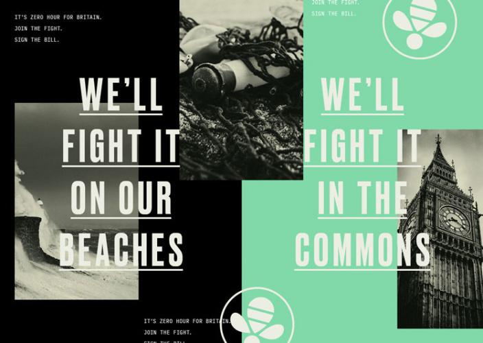
Given the subject matter, the blue colour system made sense, but it was also an attempt to avoid the baggage associated with the colour green, the design team explains. The visual identity incorporated a logo based on the ensō sign and a ripple overlay – all to move away from the “stock sustainability cliché space”. In the identity for parliamentary climate crisis campaign Zero Hour!, the team tapped into the language of WWII as a way to engage with wider audiences, particularly groups that might not have previously engaged with climate issues.
Burch also warns against the way established brands sometimes roll out a cookie-cutter version of sustainability. When “brands with cast-iron brand books” want to roll out a sustainable product, they can resort “earthy colours and weird illustrations”, which are incongruous with their branding. “It’s full of all these semiotic cues around nature – but it’s not exciting,” Burch adds.
Designing around the “sustainability liability”

One LSE study delved into what it calls the “sustainability liability”. It examined how consumers view sustainability as a positive for ‘soft’ products (such as those in the beauty category) but less favourably for ‘strong’ items (cleaning products like drain cleaner). “Consumers systematically expect such green products to be less effective, and they are less attracted to these products,” the researchers say, in reference to the ‘strong’ category.
One route around this is to learn from brands of the past, according to SomeOne founder David Law. Last year, the studio branded Ocean Saver, a cleaning product that uses dissolvable capsules to avoid waste. When it came to the visual identity, the design team drew on research into shelf packaging spanning 50 years.
“You can take the learning from the big boys who’ve basically helped people buy sugar and tobacco – things we shouldn’t have been having for the last 50 years – and find some key learnings,” he says. Ocean Saver’s wave-based identity was designed with a boldness in mind, which aims to provide a sense of efficacy, he explains. “It’s picking up on the cues you would have on 100% bleach products,” Law adds – the world of “classic post-war white goods where you have washing powders galore.”

Things have come along way from the early days of sustainable branding – “I remember a time where if you wanted to do a sustainable project, you’d get the brown paper out and everything had to be worthy,” Law says – though one challenge remains. The climate crisis is serious, and people are only becoming more concerned. That can be difficult to negotiate when it comes to branding, and people probably do not want to be reminded about the planet’s problems when buying cleaning products.
One solution is humour. For Ocean Saver, SomeOne took on the voice of a “humorous activist” – designed to be “positively provocative”, Law says. The studio created a label to look like several stuck together which people can attach to another product’s bottle, thereby changing the branding. “You can put a very sad orangutan on the product,” he says. “Or you can do it with a smile and a wink.”
Sustainable brands shouldn’t get into fights they can’t win
There will be interesting branding challenges ahead – both Jeffrey-Barrett and Law highlight the developments in meat alternatives – and there are wider elements to consider. As Otherway founder Jono Holt notes, sometimes consumer perception can be correct – relatively new sustainable products may not be as effective as their less sustainable alternatives across many categories. “There will always be a group of people that fundamentally want performance over sustainability,” he adds, pointing to the medical world.
Otherway crafted the identity for Hylo trainers, which are made from sustainable materials, emphasising performance and innovation. Its branding work for plant-based laundry detergent Kair was inspired by premium fashion. “It’s important sustainable brands don’t get into fights they can’t win but instead focus on the positives they bring to the market,” Holt says. “People are smart enough to make their minds up about the sacrifices they are willing to make for the benefit of the planet.”


You should talk about ecobranding? (Citeo, Paris 2024, Orange, Dark mode etc…)
Ecobranding are concrete solutions easily applicable by designers.