Nando’s global rebrand looks to re-connect with South African roots
Nando’s has been rebranded by South African consultancy Sunshinegun as the restaurant looks to tell its own story better and express “new African design”.
Nando’s is set to roll out a global rebrand designed to forge a stronger connection with its South African roots by celebrating both the history of the brand and modern African cultural references.
The restaurant chain was started in 1987 and now operates around 1000 restaurants in more than 30 countries.
Nando’s turned to South African consultancy Sunshinegun, which has worked with a host of South African craftsmen, artists and designers on the project.
Speaking to Design Week Sunshinegun creative partner Bronwen Rautenbach says the key to the project has been helping Nando’s create a modern South African look it can own.
Moving away from “sticks and pots”
“Rather than a dated colonialised sticks and pots look, there was an opportunity for a contemporary positioning which could be globally relevant,” says Rautenbach.
A research stage and semiotic studies showed Sunshinegun that it is the “heat and the heart” of the brand that customers best associate with.
“There is a huge emotional connection with the brand and the logo wasn’t really broken, so we’ve refined it, simplified it and made it part of a larger system,” says Rautenbach, who adds: “The heart has been made more generous, the wordmark has been modernised and smoothed and the leaves which were visual baggage have been dropped.”
The logo also features a “PERi-apostrophe”, inspired by the shape of the African bird’s eye chilli.
“PERi Red Pantone” colour-matched with chilli
The red found in the new logo and used elsewhere across the brand is a new Nando’s “PERi Red Pantone”, which has been colour-matched against an African bird’s eye chilli.
Colour specialist Manie Pieterson visited chilli fields in Mozambique to colour swatch various shades before settling on Pantone 1797.
A secondary colour palette is made up of colours associated with “new African design” – black, and bright neons, which are seen as lively and energetic choices. Many of these secondary colours have been colour-matched from contemporary design found at Nando’s “Central Kitchen” head office.
“Instead of looking at trends too much we’ve looked within the brand to find new direction and beauty; we’ve made new stories from that,” says Rautenbach.
“Nando’s Hand” font
Sign writer and artist Marks Salimu has created the “Nando’s Hand” font, which has been created by hand painting onto wooden panels and digitising the letterforms that have been created.
“He’s an amazing artist in his own right; working with people like Marks gives the brand a humanity and a humility.”
The typeface DIN Next has also been incorporated across the brand. This is the same font found on road signs in Johannesburg, where the first Nando’s opened.
87° tilt references 1987
Headlines are offset at an 87° tilt in reference to the first restaurant opening in 1987. “There’s a reason for everything within the brand,” says Rautenbach.
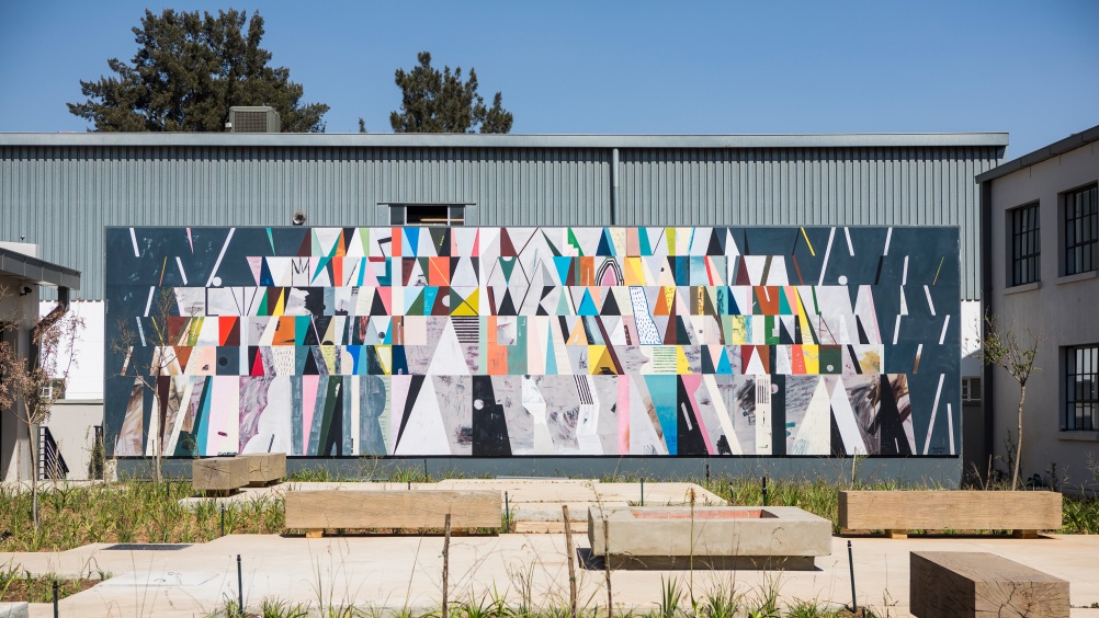
The “new African design” scene has been referenced in a series of bespoke patterns, which will replace various pictograms and illustrations.
These new graphic patterns feature triangles, traditionally representative of the family in South Africa as well as brand elements such as African bird’s eye chilies, the Nando’s heart and flames referencing the cooking process.
The silk-screen printed patterns have been digitised and manipulated to create new expressions says Rautenbach, who adds, “There’s now a buoyant and optimistic sense of joy within this brand.”




-
Post a comment

