Facebook unveils refreshed brand identity
Meta’s in-house team reveals the first phase of a larger brand refresh for Facebook, redrawing its logo and wordmark and helping its signature blue stand out.
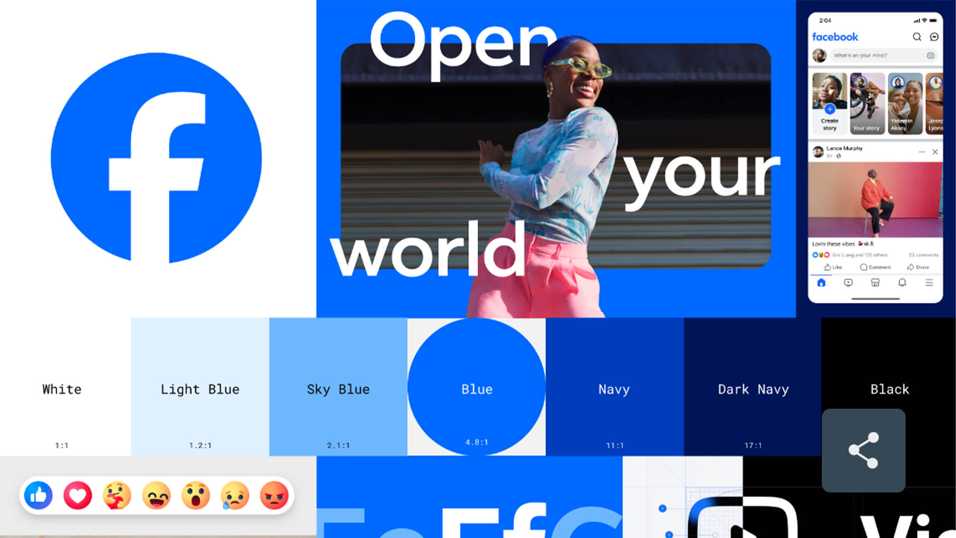
Facebook has revealed a refreshed identity aimed at unifying its brand and improving accessibility, featuring a redrawn logo and wordmark and expanded colour palette.
It follows a number of other changes for social media giants this year, with Facebook’s parent company Meta also unveiling its Twitter-rival Threads, as well as Twitter’s own surprise transformation to X.
The latest updates to Facebook’s identity have been led by Meta’s in-house design team. According to Tagu Kato, VP head of design at Facebook, it is the “first phase of a refreshed identity system for Facebook, with a focus on fostering effortless, self-initiated exploration and connection across every touchpoint”.
Kato adds that three drivers behind the evolution looked to “elevate the most iconic elements” of the brand and “unify how the Facebook brand comes to life” from its product to marketing.
The logo and wordmark have been redrawn, using Facebook’s custom typeface Facebook Sans to “create a consistent treatment and improve overall legibility”, Kato says.
He adds that this will “create a stronger relationship between how the wordmark pairs with the rest of the typeface”.
The redrawn logo also makes use of a “more confident expression” of the brand’s core blue colour, with greater contrast allowing its “f” to stand out and improve visual accessibility, according to the team.
“The goal of our work was to expand upon our foundation and create the defining mark of our brand that anchors the identity system across Facebook,” adds Dave N., Facebook director of design.
“We wanted to ensure that the refreshed logo felt familiar, yet dynamic, polished and elegant in execution. These subtle, but significant changes allowed us to achieve optical balance with a sense of forward movement.”
The core blue will now be used within a more expansive colour palette, including a wider span of blues from light blue to dark navy.
Facebook’s emoticons, known as Reactions, will also be updated. According to Facebook, these updates are undergoing testing at present “and will be rolled out in the coming months”.
Hinting at what is to come, the team explains that it will be using its expanded colour palette to “evoke more dimensionality and emotion in Reactions”.
Adjustments to the icons also look to improve accessibility across the app and ensure legibility at any size.
“Leaving no pixel unturned, we rebuilt the entire iconography system so that it scales with a wide range of expressions across each moment within the app”, Kato says.
Facebook previously spoke with Design Week about how its range of in-house design teams work together, and collaboration between its different teams was equally key to this latest brand refresh.
May Hartono, director of design at Meta adds: “Strong interaction and partnership between product, brand strategy, brand design and engineering have bene the key to driving cohesion across the entire design system. We look forward to continuing this collaboration and bringing the brand to life.”
All images courtesy of Meta/Facebook.


Rebranding isn’t just about changing the look of a brand. It’s more about giving a fresh start to the company’s values and what it stands for in a world that keeps changing. Facebook’s recent rebranding along with so many other social platforms recently makes me think about how they want to be seen in terms of privacy, safety, and how they use technology? It’s not just about changing the design, but also about asking bigger questions about technology’s role in our lives and what comes next. it would be interesting to find out how and if this factored in the redesign.